RENATO RULLI
CASE STUDY: ESPAÇO ERA
CASE STUDY: ESPAÇO ERA
Complete Design Thinking Process - 2024 Freelance
Complete Design Thinking Process - 2024 Freelance
Scope of the Project
Scope of the Project
Complete UX and UI Process
High Fidelity Prototypes for Mobile and Desktop
Programming of any sort was not included (Front or Back)
Complete UX and UI Process
High Fidelity Prototypes for Mobile and Desktop
Programming of any sort was not included (Front or Back)
Agenda
Agenda
Click on the items below to go to the respective section, or continue scrolling:
Click on the items below to go to the respective section, or continue scrolling:
INTRODUCTION TO POLE DANCE AND THE BRAND
INTRODUCTION TO POLE DANCE AND THE BRAND
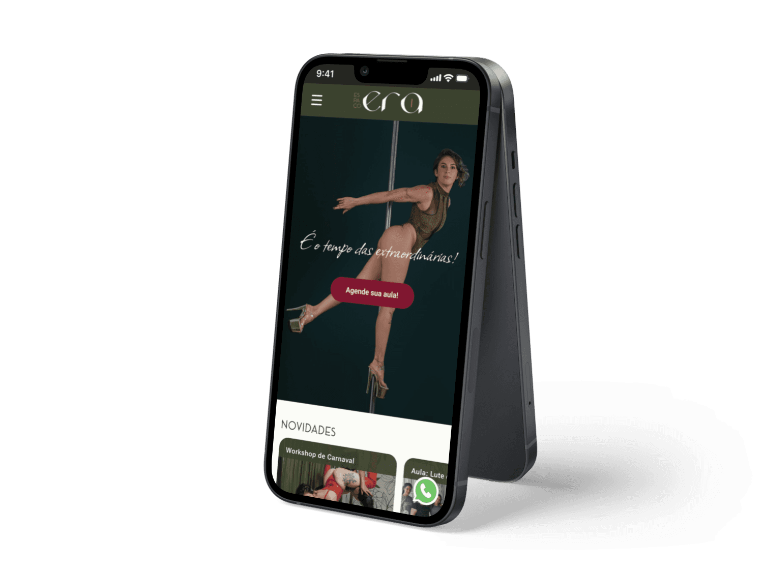
About the brand - ERA
About the brand - ERA
Established in 2022
This studio aims to be a sanctuary of self-esteem and encouragement, especially for women. With a focus on women empowerment, self-awareness, and fostering moments of self-connection, it helps create women who become even more extraordinary with each year that passes.
The studio primarily teaches pole dancing and its various styles, along with other activities aligned with its mission, such as Twerk, Flexibility, and Belly Dance classes. Additionally, it hosts workshops on pole dancing and women's overall health, including self-defense, feminism, and the challenges women face in the 21st century.
Slogan: It's time of the extraordinary!
Slogan: It's time of the extraordinary!
Student's Google Reviews:

“Incredible, the classes are cheerful and we leave feeling really well!”
“Incredible, the classes are cheerful and we leave feeling really well!”
“Love it, the environment and teachers”
“Love it, the environment and teachers”
“A place where any woman, with any kind of body, can feel extraordinary”
“A place where any woman, with any kind of body, can feel extraordinary”
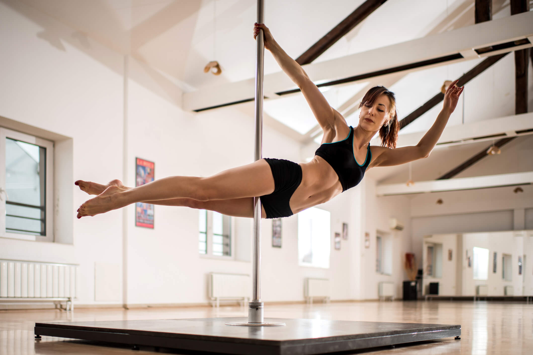
About Pole Dancing
About Pole Dancing
Pole dance combines elements of dance, gymnastics, and physical fitness. Through acrobatic movements on a vertical pole that require strength, flexibility, balance, and endurance, pole dance engages a wide range of muscles throughout the body.
Helps in gaining strength, resistance and body awareness
Help with self-confidence, self-esteem and even a better sleep quality
MARKET ANALYSIS
MARKET ANALYSIS
About the Market
About the Market
Scroll to see the complete analysis:

Website?
Location
Slogan/
Focus
Osasco, SP
Espaço ERA
It's time of the extraordinary
Space for Women
No
Studio Metropole
Yes
Consolação, SP
Maximizing each student’s potential by fostering physical, mental, and emotional transformations through the practice of pole dance.
Moonlight Pole Dance
N/A
No
Vila Prudente, SP
Purple Wings Pole Dance
Come spread your wings at the best studio in town! Laid-back, youthful, and vibrant
No
Centro, SP
WA Danças
Tatuapé e Paulista, SP
We are transformation through dance. Respect, diversity, and growth
Yes
Studio Arte Movimento
The world is in motion. The body is in motion. And with every step of the dance, SAM is always in motion. Experience, transformation, and tradition.
Yes
Vila Prudente, SP
Cia Cadence
Yes
Vila Clementino, SP
Come test your limits. Challenging and joyful.
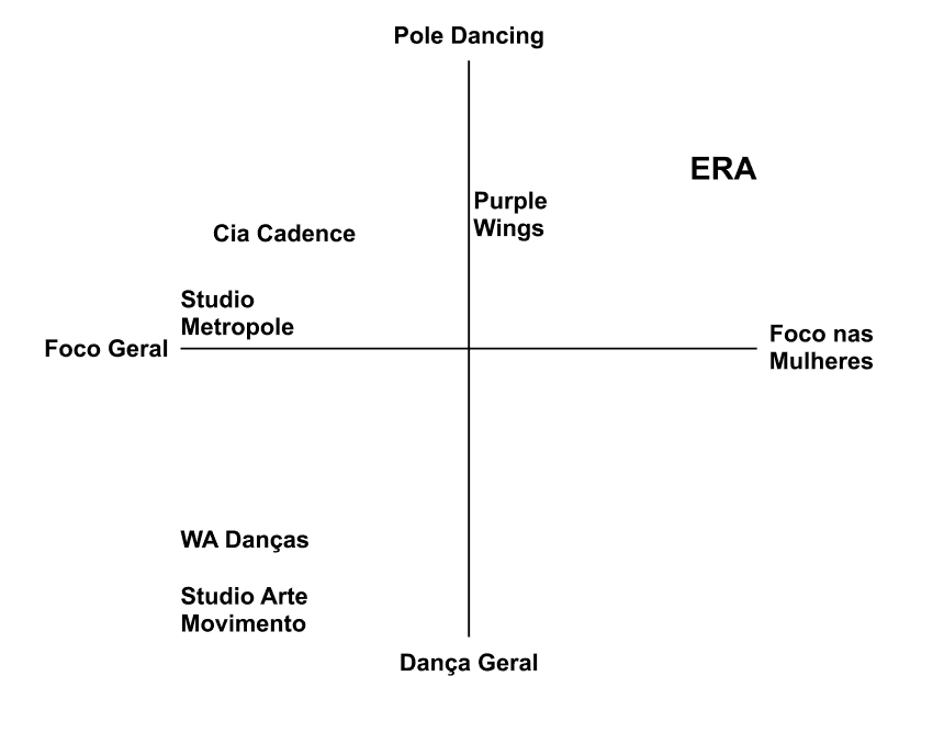
Notable points:
The absence of a website puts ERA at a serious disadvantage compared to its competitors, not only in terms of reach but also in brand overall establishment.
There are no direct competitors in the Osasco area
It’s the only studio with a distinctive branding and personality, directly connected to its target consumers
Market Positioning Map
Market Positioning Map
UX Blueprint
UX Blueprint
Goals
Goals
Online presence expansion
Make information about the studios, products, and services clearer and more accessible
Streamline and expedite processes for employees
Reduce the time needed to convert clients
Provide another way to acquire clients and new partners
Increase and establish brand presence
Add further legitimacy to the business
Focus on Mobile, but optimized for Desktop
Principles
Principles
Branding continuity and social media presence, highlighting its unique qualities
Beautiful yet simple design for easy and cost-effective website implementation
Design focused on the potential scalability of the business
Aligning user needs with the company’s goals
Testing, testing and more testing
Branding continuity and social media presence, highlighting its unique qualities
Beautiful yet simple design for easy and cost-effective website implementation
Design focused on the potential scalability of the business
Aligning user needs with the company’s goals
Testing, testing and more testing
SUCCESS METRICS
SUCCESS METRICS
Increase of 20% to 30% in new clients
Increase of 20% to 30% in new clients
Decrease average conversion time by 10% to 30%
Decrease average conversion time by 10% to 30%
Decrease by 20% to 40% the number of necessary messages
Decrease by 20% to 40% the number of necessary messages
Increase of 10% to 25% in client's satisfaction
Increase of 10% to 25% in client's satisfaction
RESEARCH
RESEARCH
Goals
Goals
Confirm information and insights
Gain a deeper understanding of target users and their habits
Understand the relationship between target users and Pole Dancing
Clarify user's priorities
For current students, understand their perspective on the studio and the classes offered.
For non-students, determine if they had any experience with pole dancing, and if so, explore the details; if not, find out what sparked their interest and why they haven’t tried it yet.
Why:
The decision to conduct purely qualitative research is justified by the goal of gathering personal insights and individual experiences. Questions and their corresponding answers would be too long and ineffective in an online survey format, and statistical data wouldn’t be as helpful in understanding the situation at that time.
Hypothesis to be confirmed:
Welcoming and empowering environment
Verify if pole dance has the impact mentioned in the previously shown research and by the stakeholder
Understand students' relationship with physical activity and self-care
Clients appreciate the organization and communication, but there is still room for improvement.
Results
Results
Welcoming Environment
A sense of unity has been created among the students—a community that supports and uplifts each other. This is a distinctive feature that impacts their lives far beyond just a physical activity.
“It’s a very pleasant environment where you get to meet a lot of people and form a very close-knit group”
Priorities between Students and Non-Students
Location
Price
Visuals and studio appearance
Essential information according to the interviewee
Classes (with visuals)
Teachers
How to Get There and Parking
Plans, Price and GymPass
Class Schedule
Frequent Asked Questions (FAQ)
Impact on the Students
“I'm less sedentary now. My shyness and self-esteem got way better.”
“I'm loving much more my body. Asserting myself and imposing non-restrictions.”
Visual Branding was accepted and complimented:
“The Visual Branding is very nice”
“The visual branding and social media caught my attention”
Doesn't like gyms, but needs an physical exercise
“There's nothing better than doing an exercise and enjoying it”
“I wanted to do a sport, but not gym”
“I wanted a dance to explore my sensuality”
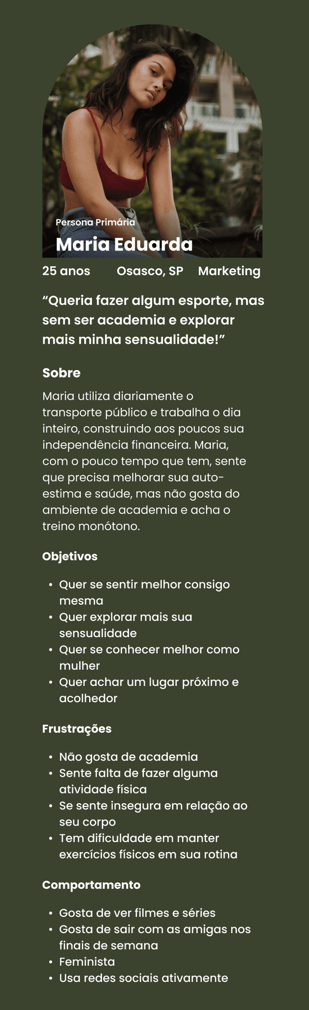
Feel better about herself
Explore more her sensuality
Get to know herself better as a woman
Find a nearby and welcoming place
Goals
Doesn't like gyms
Miss doing exercises
Feels insecure about her body
Has difficulty maintaining physical exercises in her routine
Pains
Likes to watch movies and series
Enjoy going out with her friends on the weekend
Feminist
Uses social media a lot
Behavior
Maria uses public transportation daily and works all day, gradually building her financial independence. With the little free time she has, she feels the need to improve her self-esteem and health but dislikes the gym environment and finds the workouts monotonous.
About
I wanted to do a sport, but not gym and wanted to explore my sensuality!
Marketing
Osasco, SP
25 years

Maria Eduarda
Primary Persona
Feel better about herself
Explore more her sensuality
Get to know herself better as a woman
Find a nearby and welcoming place
Goals
Doesn't like gyms
Miss doing exercises
Feels insecure about her body
Has difficulty maintaining physical exercises in her routine
Pains
Likes to watch movies and series
Enjoy going out with her friends on the weekend
Feminist
Uses social media a lot
Behavior
Maria uses public transportation daily and works all day, gradually building her financial independence. With the little free time she has, she feels the need to improve her self-esteem and health but dislikes the gym environment and finds the workouts monotonous.
About
I wanted to do a sport, but not gym and wanted to explore my sensuality!
Marketing
Osasco, SP
25 years
Maria Eduarda
Primary Persona
DEFINITION
DEFINITION
Project Goals
Project Goals
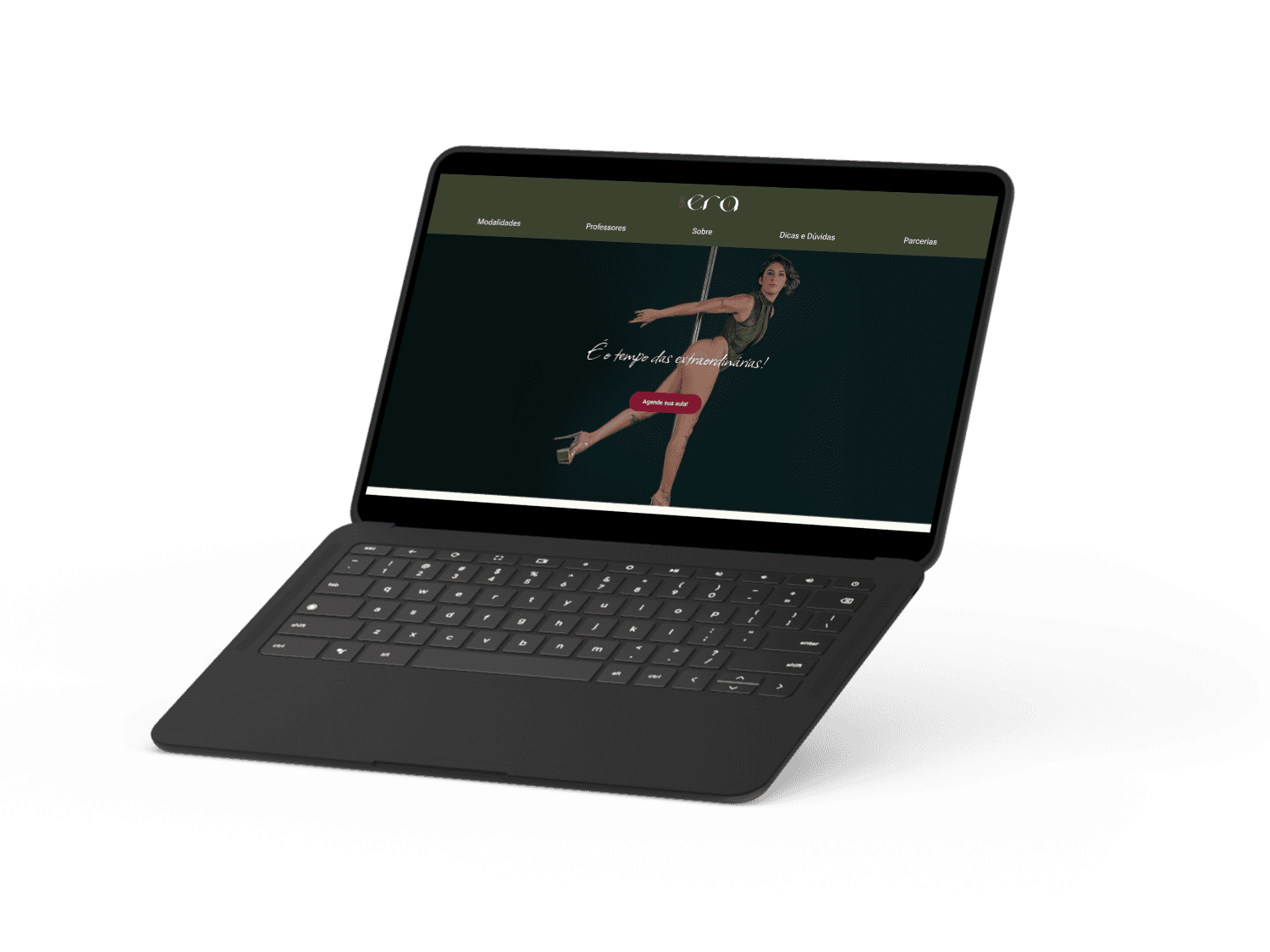
Responsive Web App - Focused on Mobile (due to higher user engagement) and secondary on Desktop.
Clear information.
Continuation of the Visual Branding.
Make customer conversion faster and clearer.
Establish the brand.
Responsive Web App - Focused on Mobile (due to higher user engagement) and secondary on Desktop.
Clear information.
Continuation of the Visual Branding.
Make customer conversion faster and clearer.
Establish the brand.
Project Limitations
Project Limitations
No extensive or complex animations; focus on a simple and functional user experience.
Focus on creating a functional MVP.
No marketplace on the site.
No class booking system directly on the site
No extensive or complex animations; focus on a simple and functional user experience.
Focus on creating a functional MVP.
No marketplace on the site.
No class booking system directly on the site
HOW CAN WE CREATE AN ENVIRONMENT WHERE MARIA FEELS WELCOMED AND BETTER ABOUT HER SELF-ESTEEM?
HOW CAN WE CREATE AN ENVIRONMENT WHERE MARIA FEELS WELCOMED AND BETTER ABOUT HER SELF-ESTEEM?
Site-map
Site-map
The initial plan was to have a longer homepage with extensive scrolling, reducing the number of clicks needed for client conversion. However, there would still be other specific pages diving into topics that wouldn't fit on the homepage or would make it overly long.
The initial plan was to have a longer homepage with extensive scrolling, reducing the number of clicks needed for client conversion. However, there would still be other specific pages diving into topics that wouldn't fit on the homepage or would make it overly long.
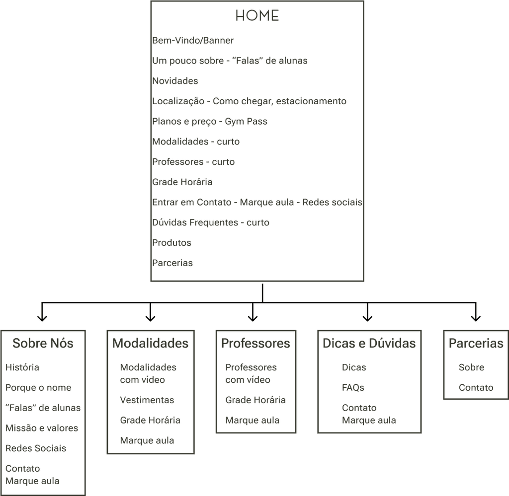
Home
Bem-Vindo/Banner
Um pouco sobre - “Falas” de alunas
Novidades
Localização - Como chegar, estacionamento
Planos e preço - Gym Pass
Modalidades - curto
Professores - curto
Grade Horária
Entrar em Contato - Marque aula - Redes sociais
Dúvidas Frequentes - curto
Produtos
Parcerias
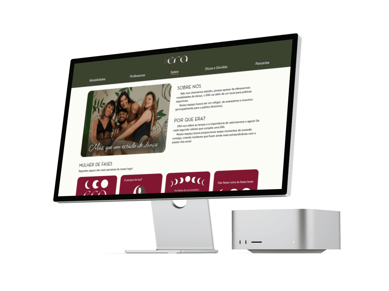
About Us
História
Porque o nome
“Falas” de alunas
Missão e valores
Redes Sociais
Contato
Marque aula
Classes
Modalidades
com vídeo
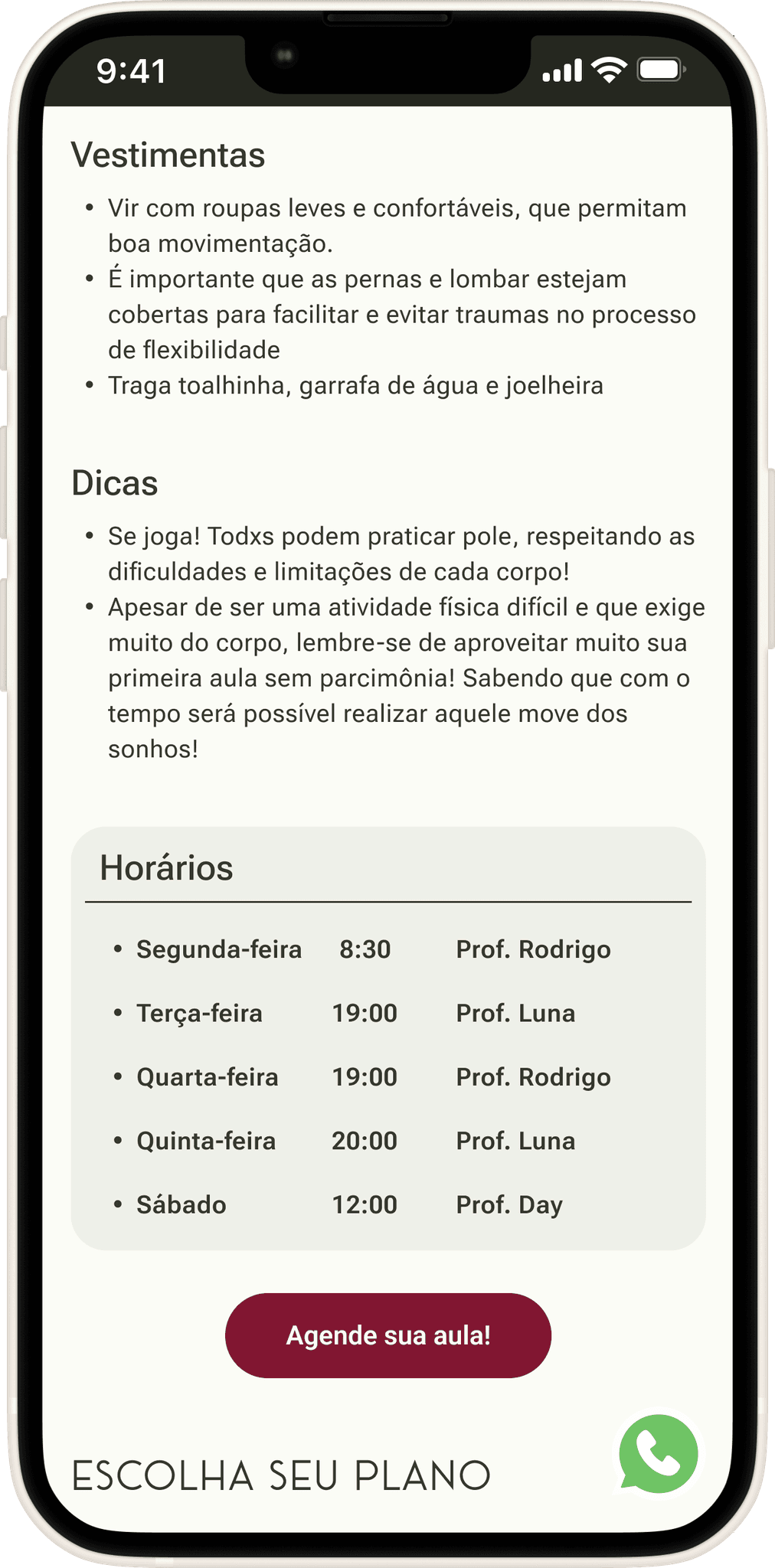
Vestimentas
Grade Horária
Marque aula
Instructors
Professores
com vídeo
Grade Horária
Marque aula
FAQ
Dicas
FAQs
Contato
Marque aula
Partners
Sobre
Contato
Prototypes and testing
In this section of the case, we will cover the entire process behind the creation of the interfaces and showcase the interfaces themselves. Since this is a detailed and somewhat lengthy topic, the content has been divided into subsections that reflect the project’s objectives
To access the desired subsection or theme, you only need to click on the respective subsection button below:
Clear Information
Information Structure
Responsive WebApp
Visual Branding Continuation
Brand Establishment
Quicker Customer Conversion
CLEAR INFORMATION
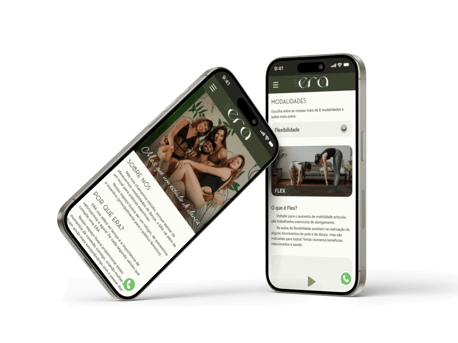
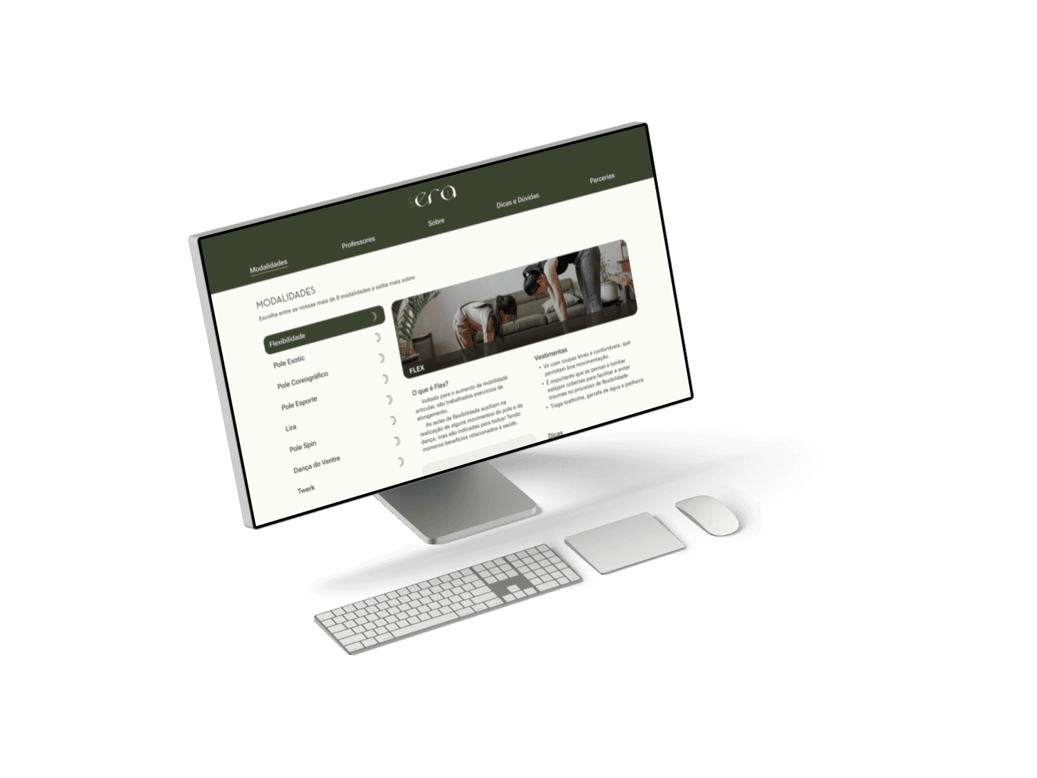
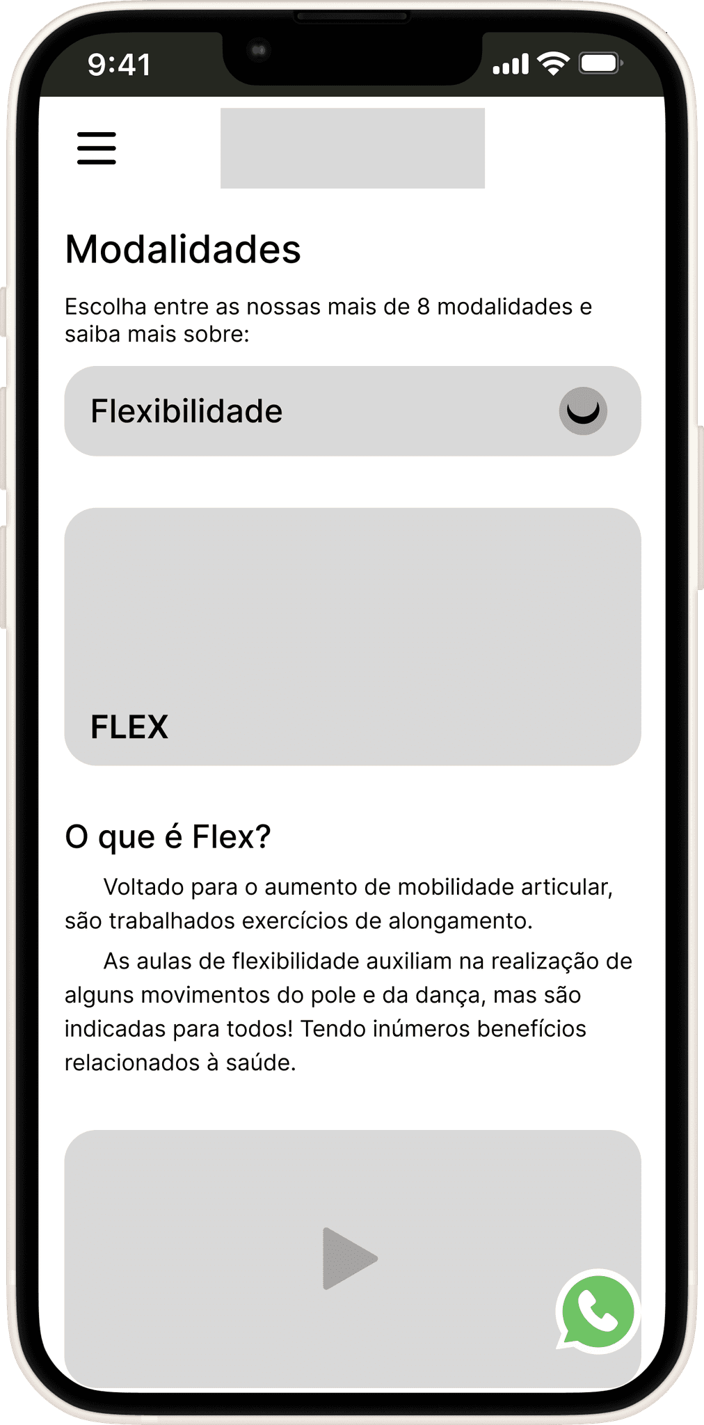
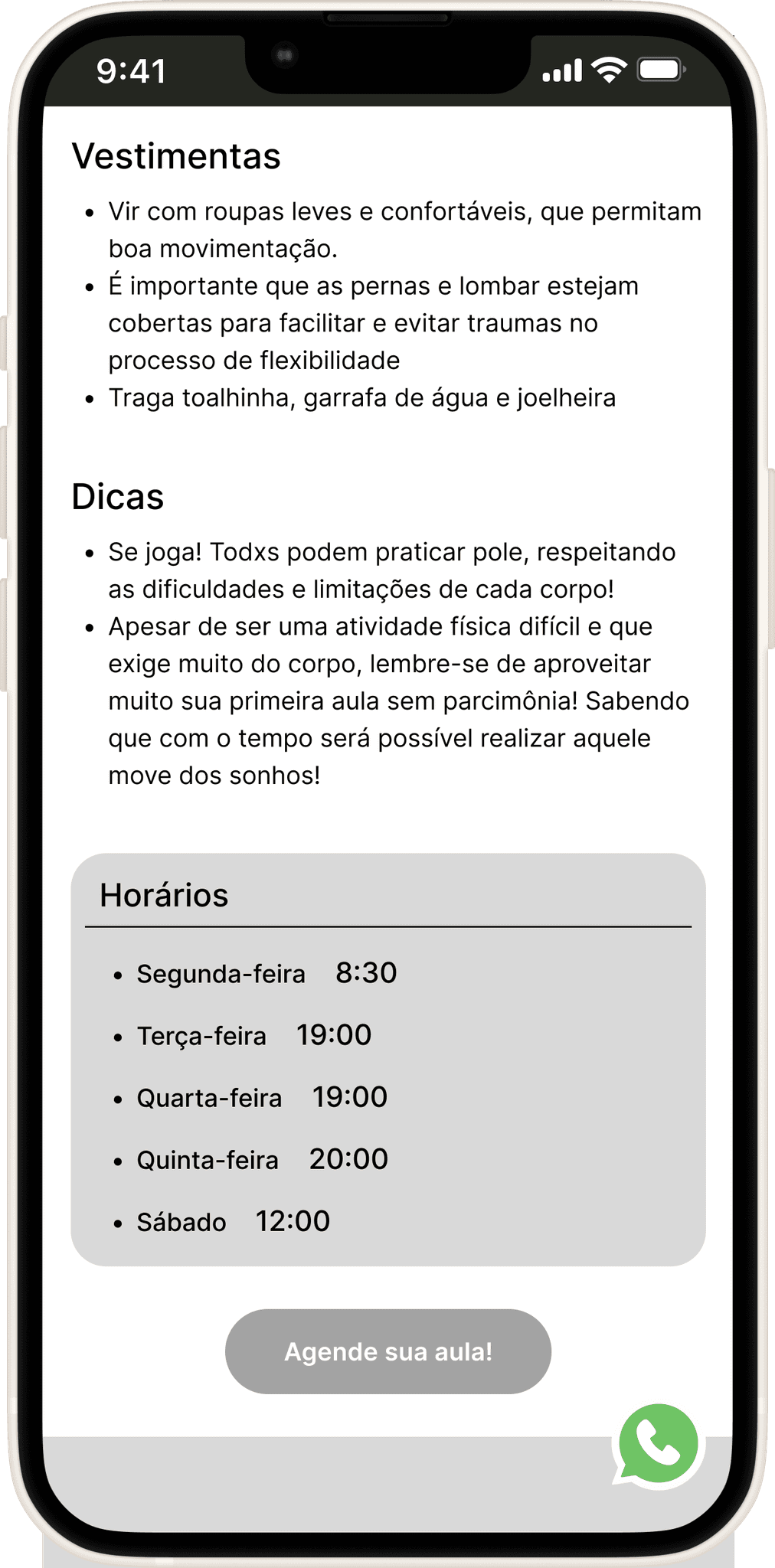
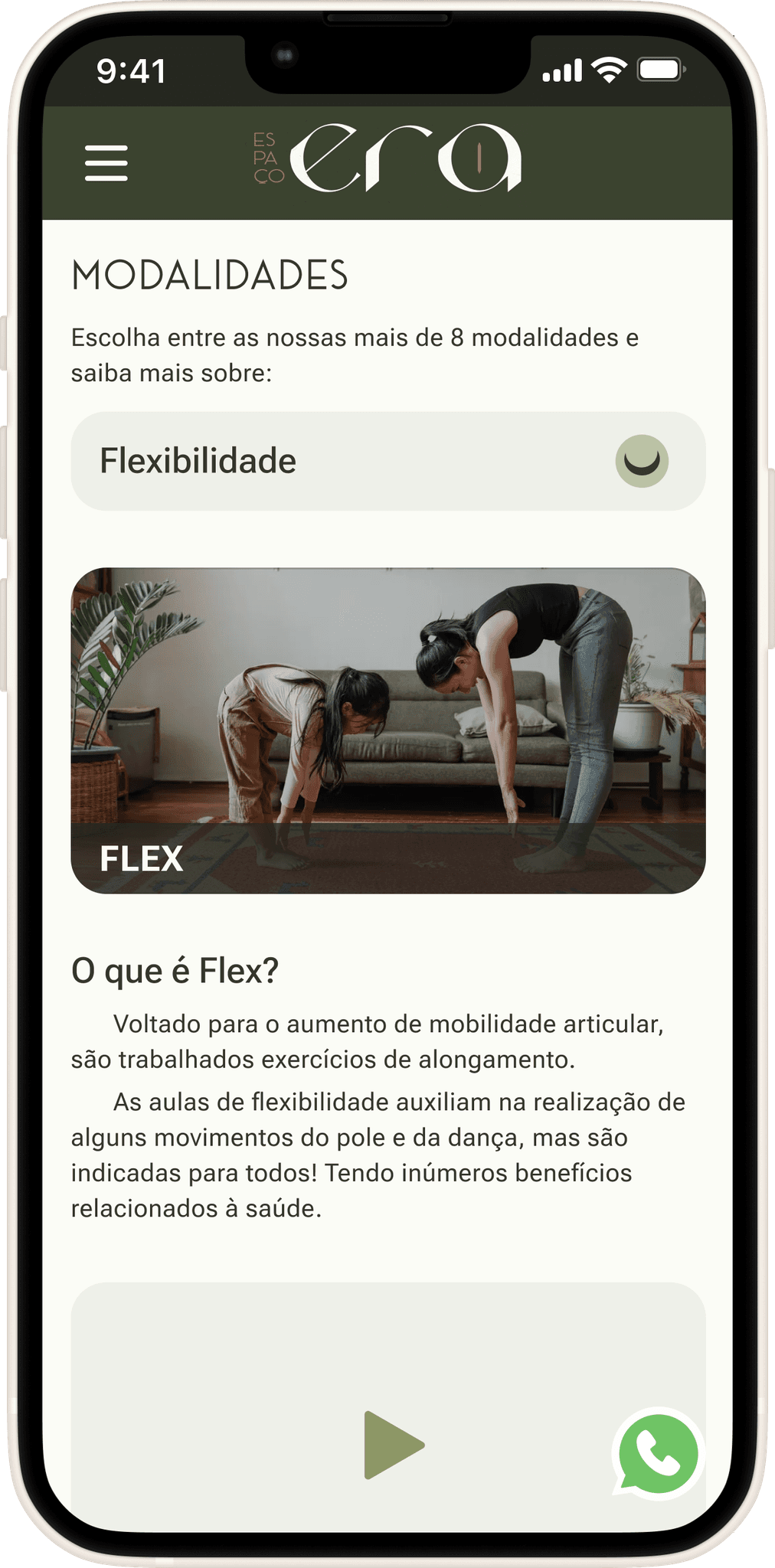
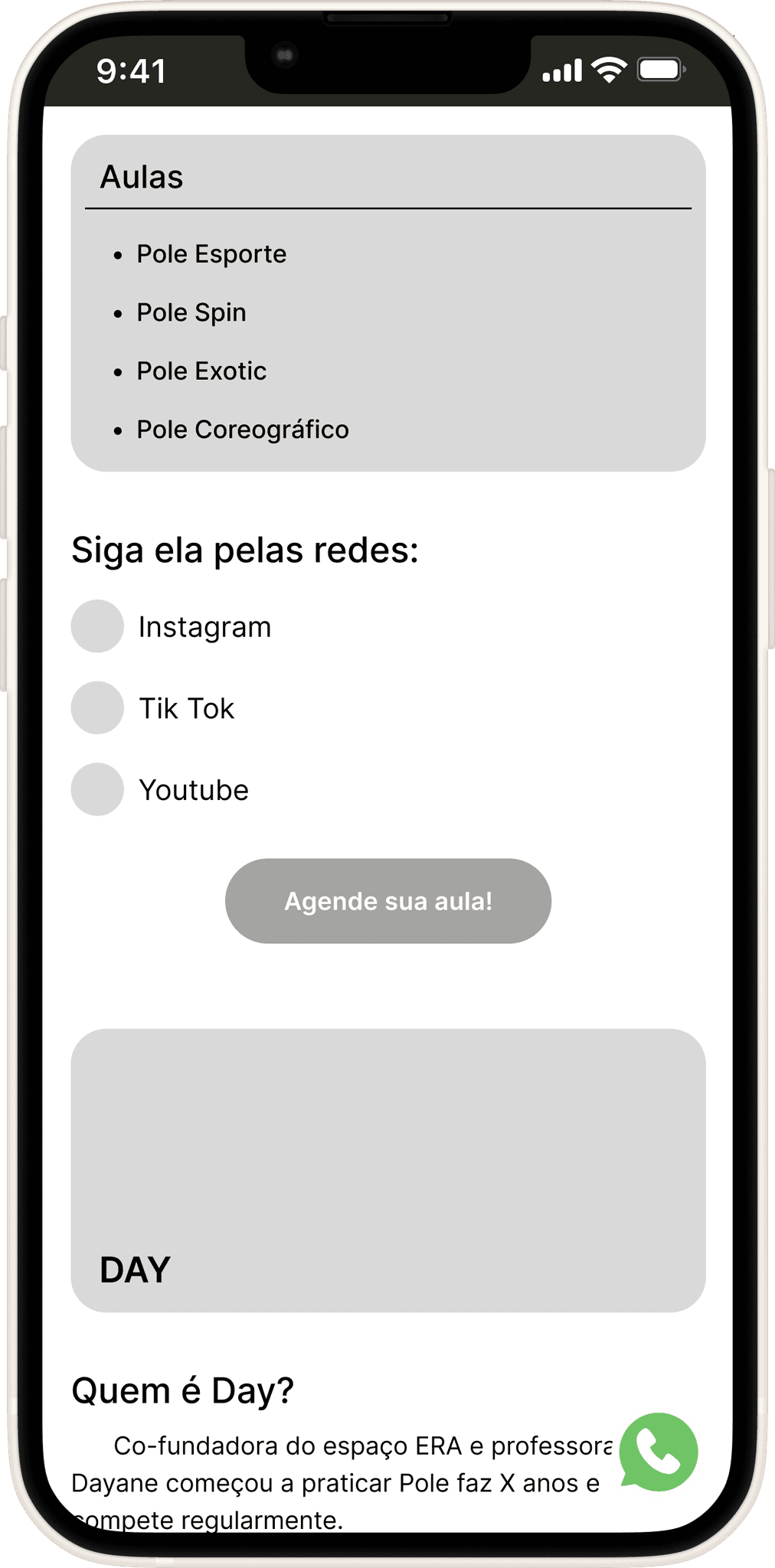
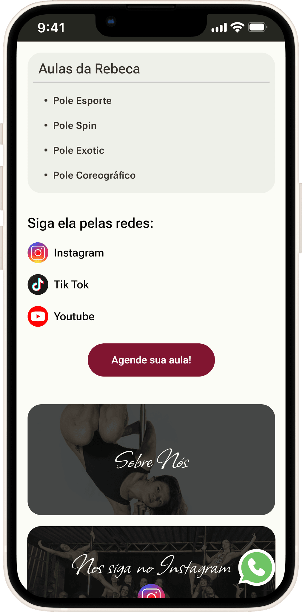
Classes
Based on the needs expressed in the interviews, a text description of the class was provided, along with a video for better understanding by those unfamiliar with it, as well as information on attire, schedules, and key tips. The goal is to address questions both current and potential students, thereby reducing the number of interactions and communications required from staff.
Usability Testing Insights:
Identify which teachers are assigned to specific classes at certain times
Improve clarity of the schedule. Solved by vertically aligning class times regardless of the day
The need to know pricing at this point during navigation. Solved by adding a pricing/plans section just below for easier access and clarity.
Lack of continuity and flow on the page. Solved by adding cards that direct users to other relevant and associated pages..
Mid-Fi 1.0
Hi-Fi
1
2
3
4
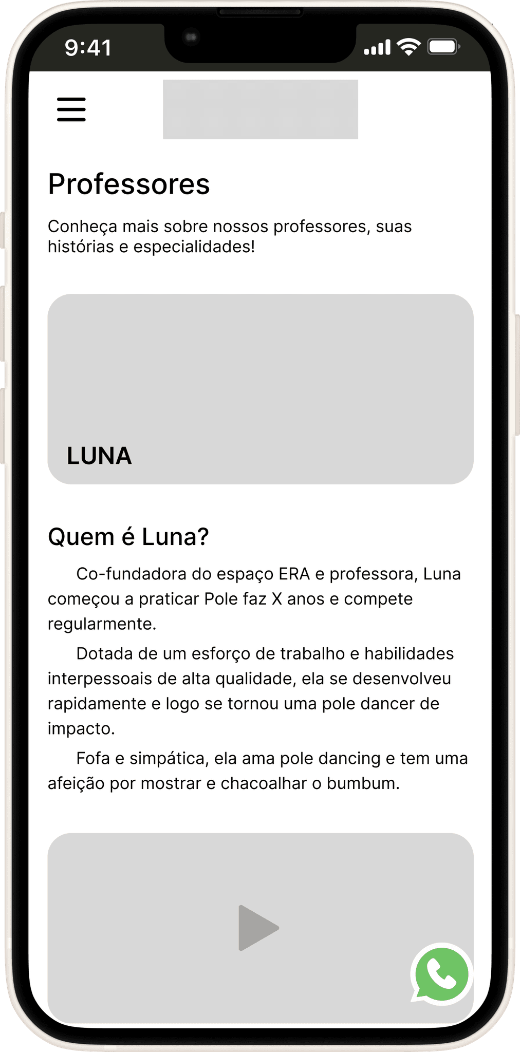
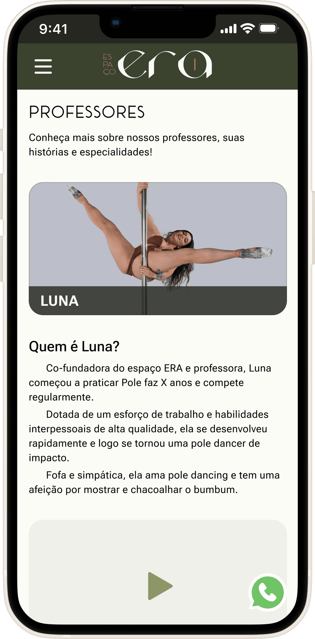
Teachers
Based on the needs expressed in the interviews, a text description of each teacher was provided, along with a performance video to better understand their style, the classes they teach, and links to their preferred social media for further exploration if desired.
Usability Testing Insights:
Some users got lost at certain points and didn’t know which teacher was being referred to. This was solved by adding the teacher’s name in the class section, creating an additional point of reference
The same issue of lack of continuity and flow on the page. Solved by adding cards that direct users to other relevant and associated pages.
Mid-Fi 1.0
Hi-Fi
1
2
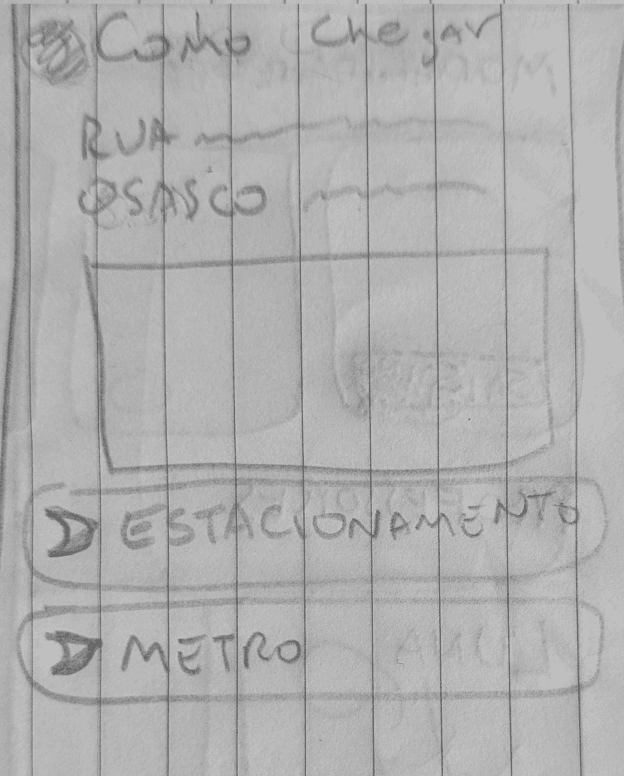
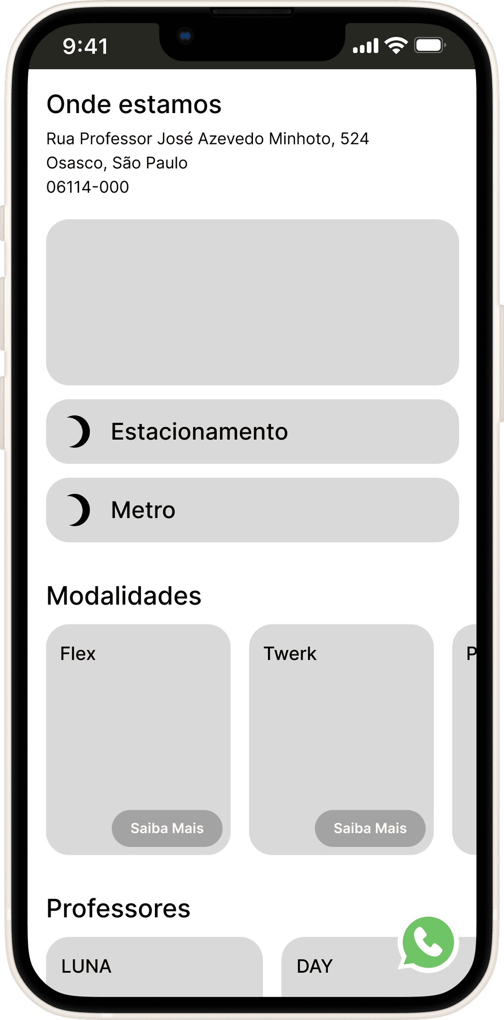
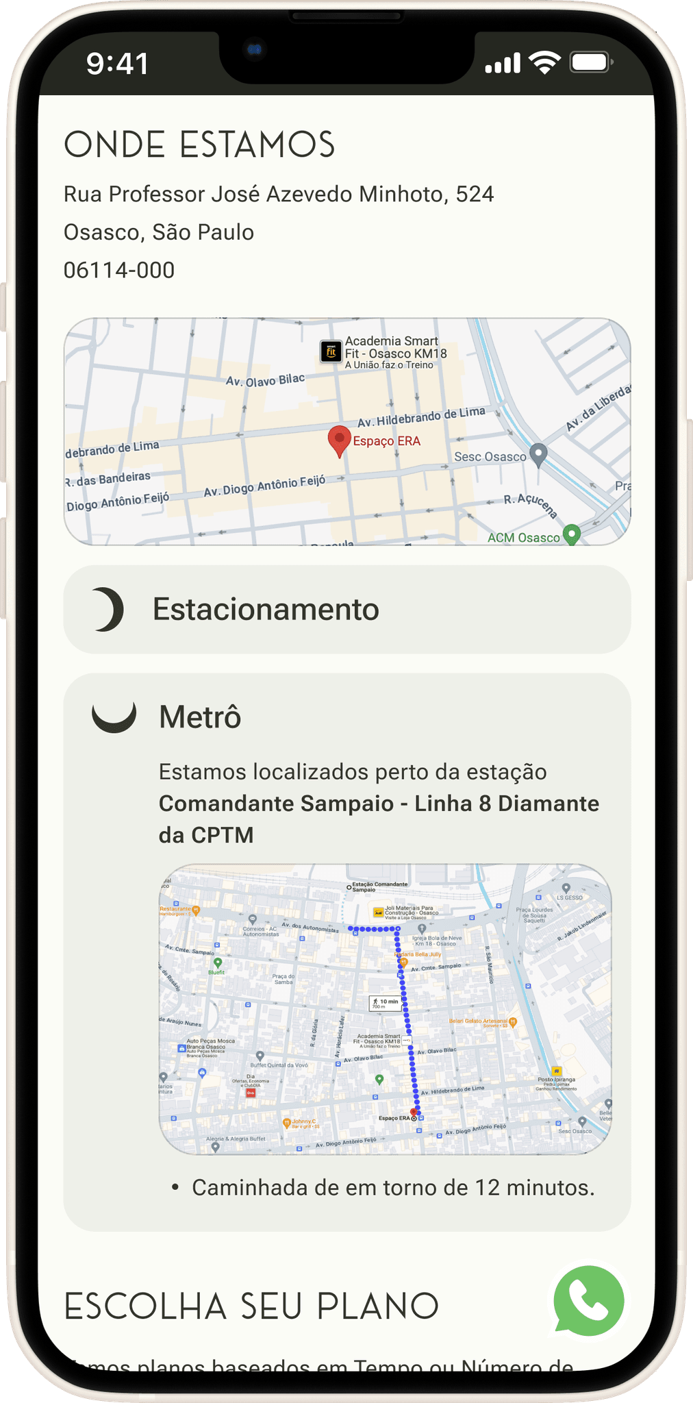
How to get there, Location and Parking
Location was a high priority in this project. The need to highlight two related factors was also identified: parking (mentioned by some interviewees) and directions for public transportation (specifically the metro, including walking time for safety and convenience).
Lo-Fi
Mid-Fi 1.0
Hi-Fi
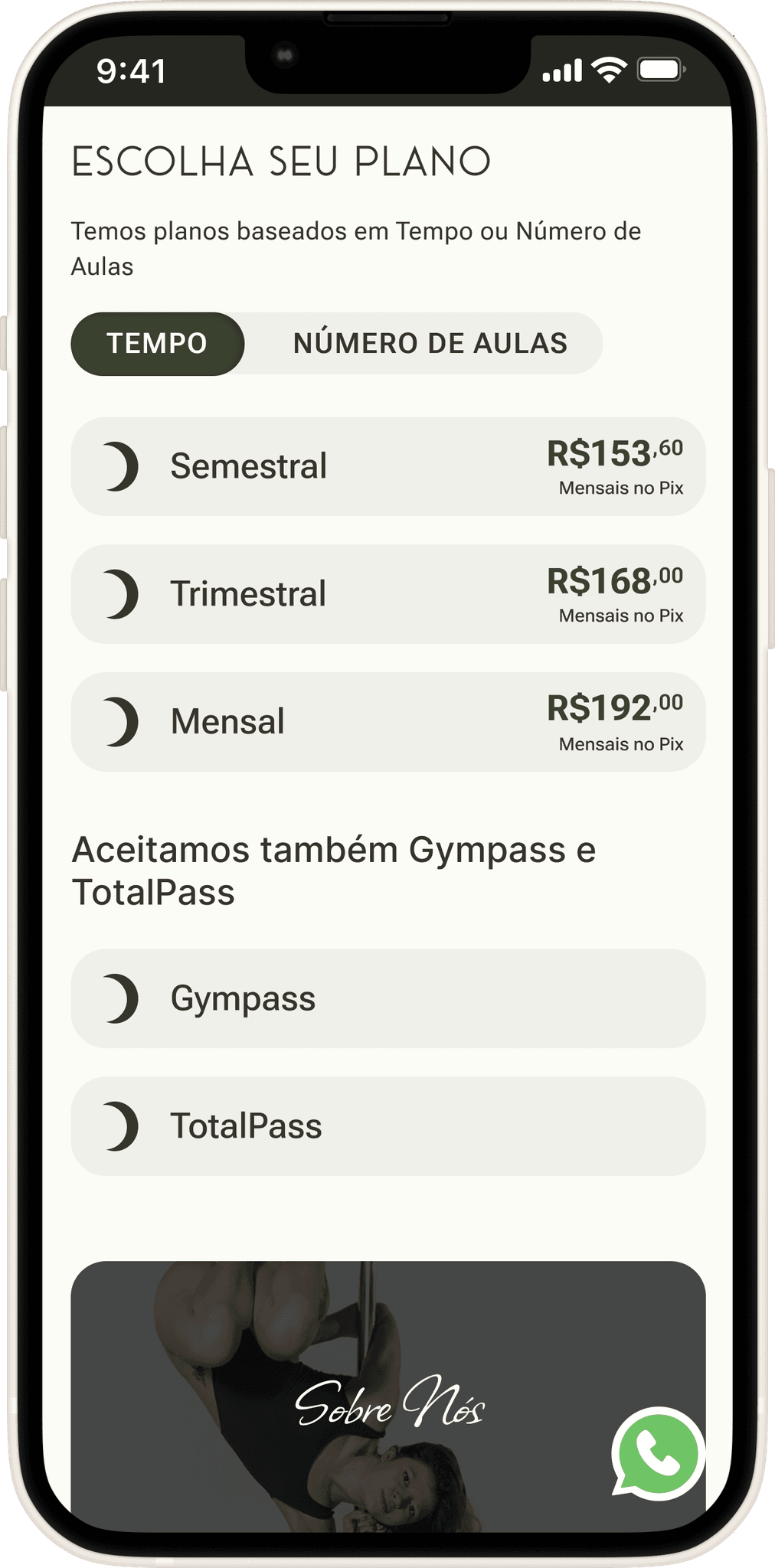
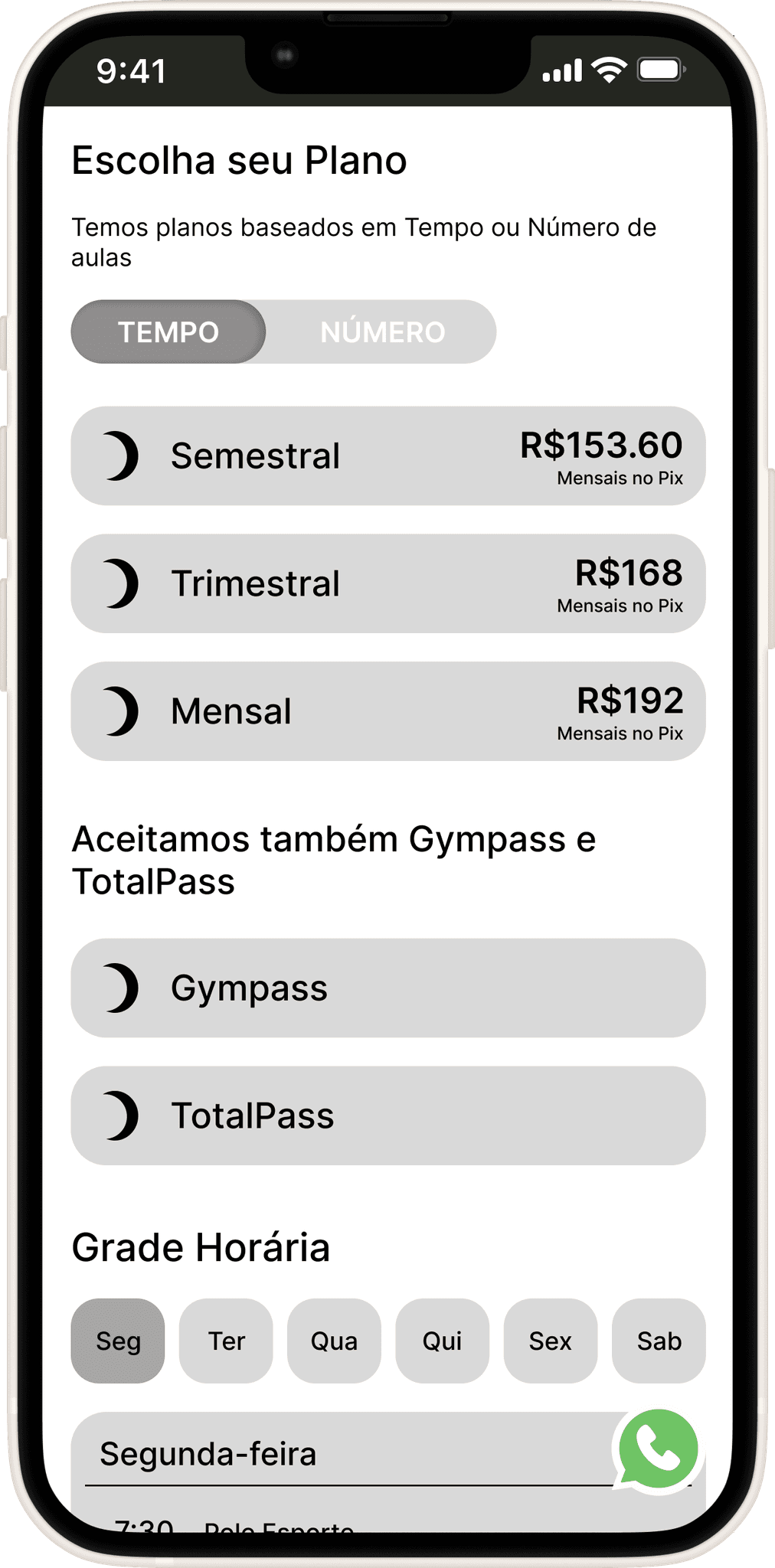
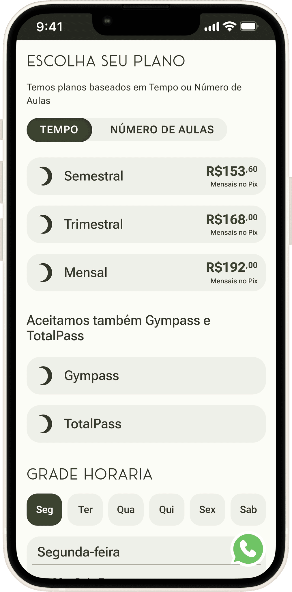
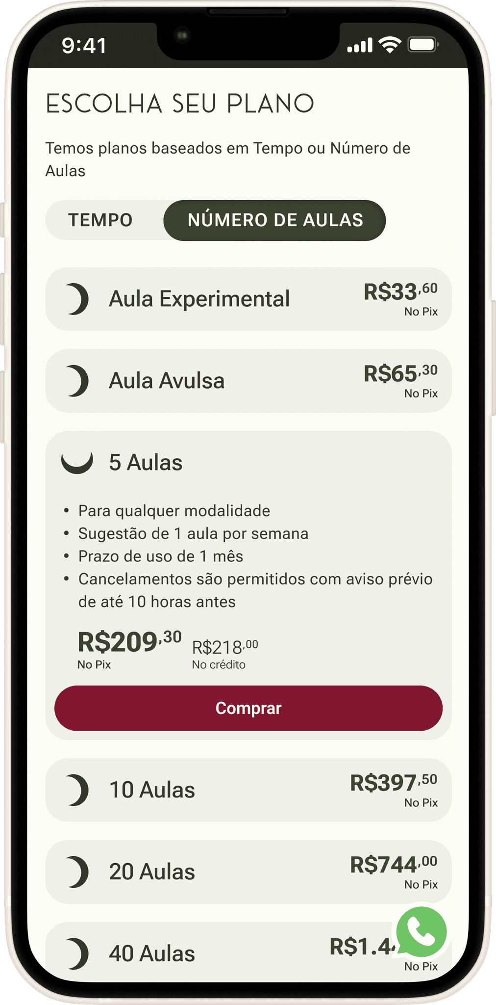
Plans and Gympass
The Plans and Passes (TotalPass and Gympass) sections complement each other, forming the pricing section. The choice of drop-down cards was particularly necessary due to the large amount of information in this section, allowing users to focus on their preferred options
Lo-Fi

1
Mid-Fi 1.0
Hi-Fi
2
After 2 rounds of usability testing, it was noted a few needs and necessary changes:
The toggle button for selecting the plan type caused a lot of confusion, and users didn’t understand what it referred to. This was resolved by clarifying the text within the button, adding 'of classes.'
The prices had inconsistencies due to decimal points and the different use of commas, which caused confusion for the general public. This was resolved by using commas only for decimal places and periods for numbers in the thousands. Elevated font size was also used for the decimal places.
Hi-Fi
Tips and FAQ
Lo-Fi
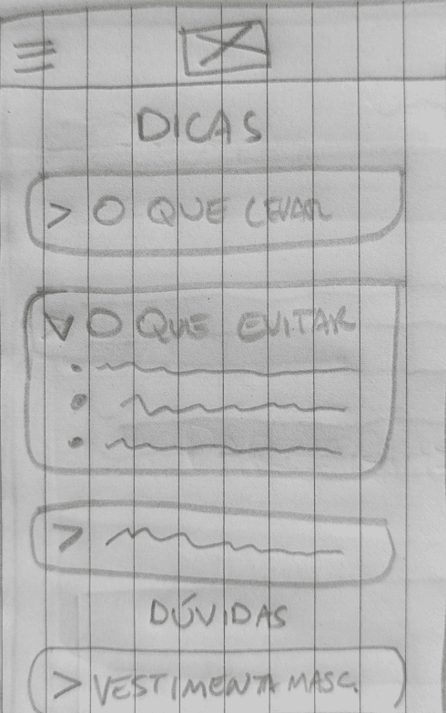
Mid-Fi 1.0
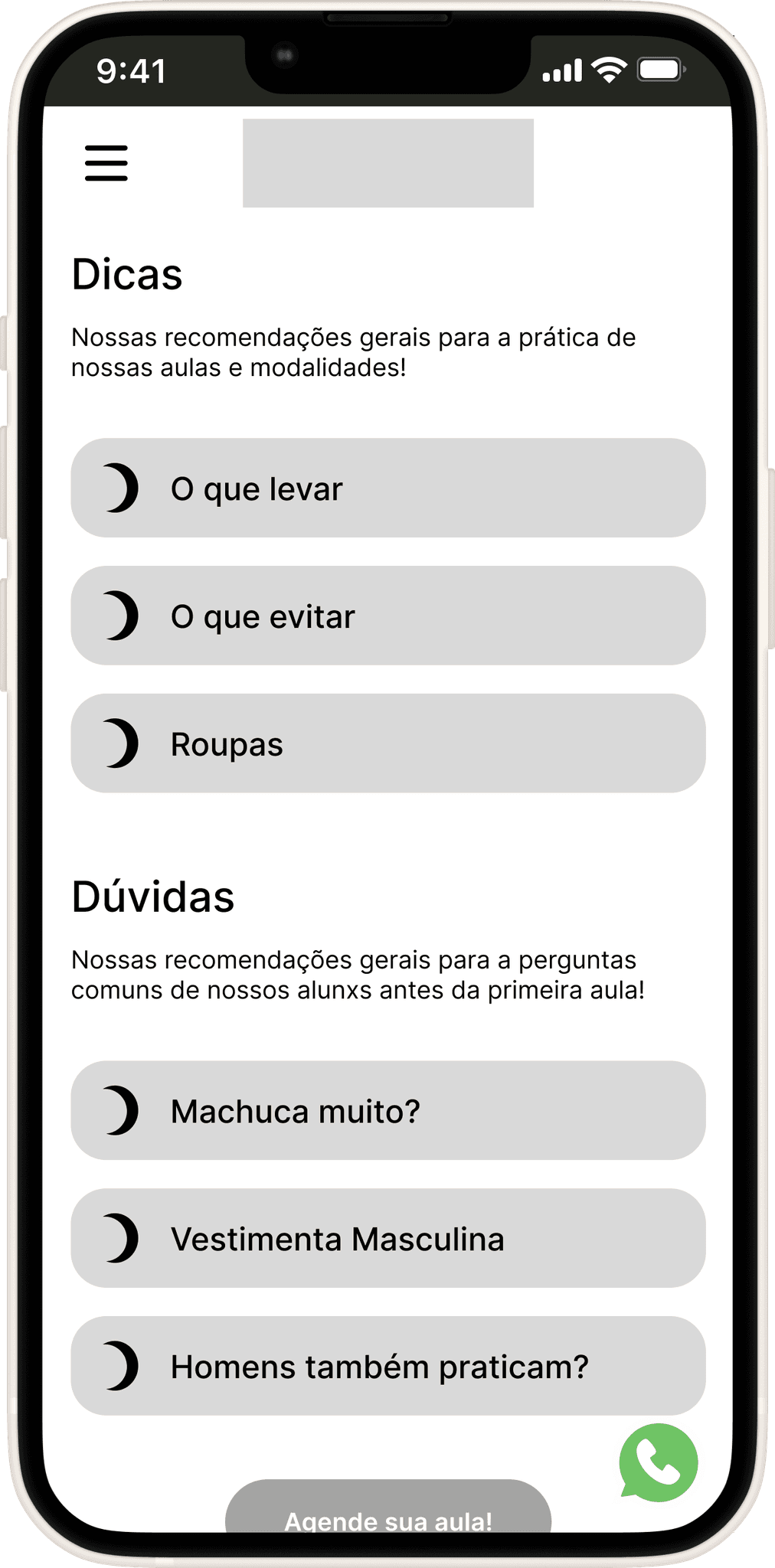
Hi-Fi
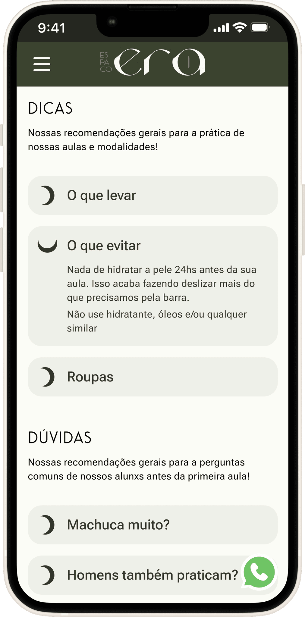
The Tips and FAQs page is somewhat important to users; however, its significance is more evident during the period before the first class or during the initial classes.
One factor that emerged during usability testing was the need for broader reach and access to this section on the homepage. This was addressed by adding a link to this page in the navigation cards at the bottom of the homepage, a solution that became a standard for all pages, as mentioned earlier.
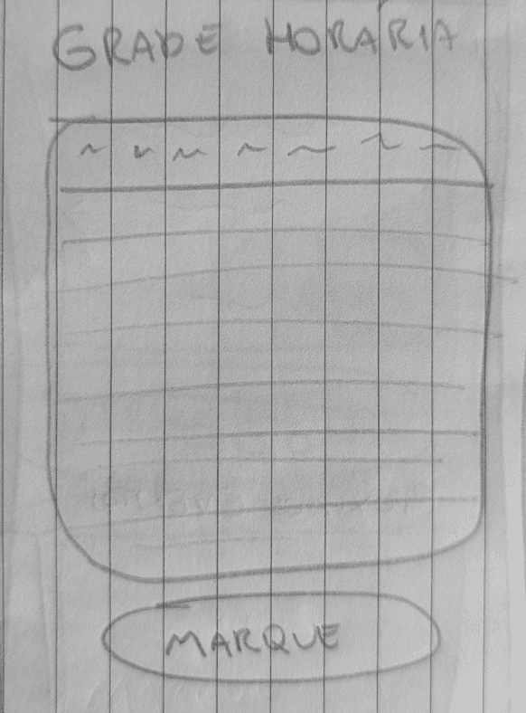
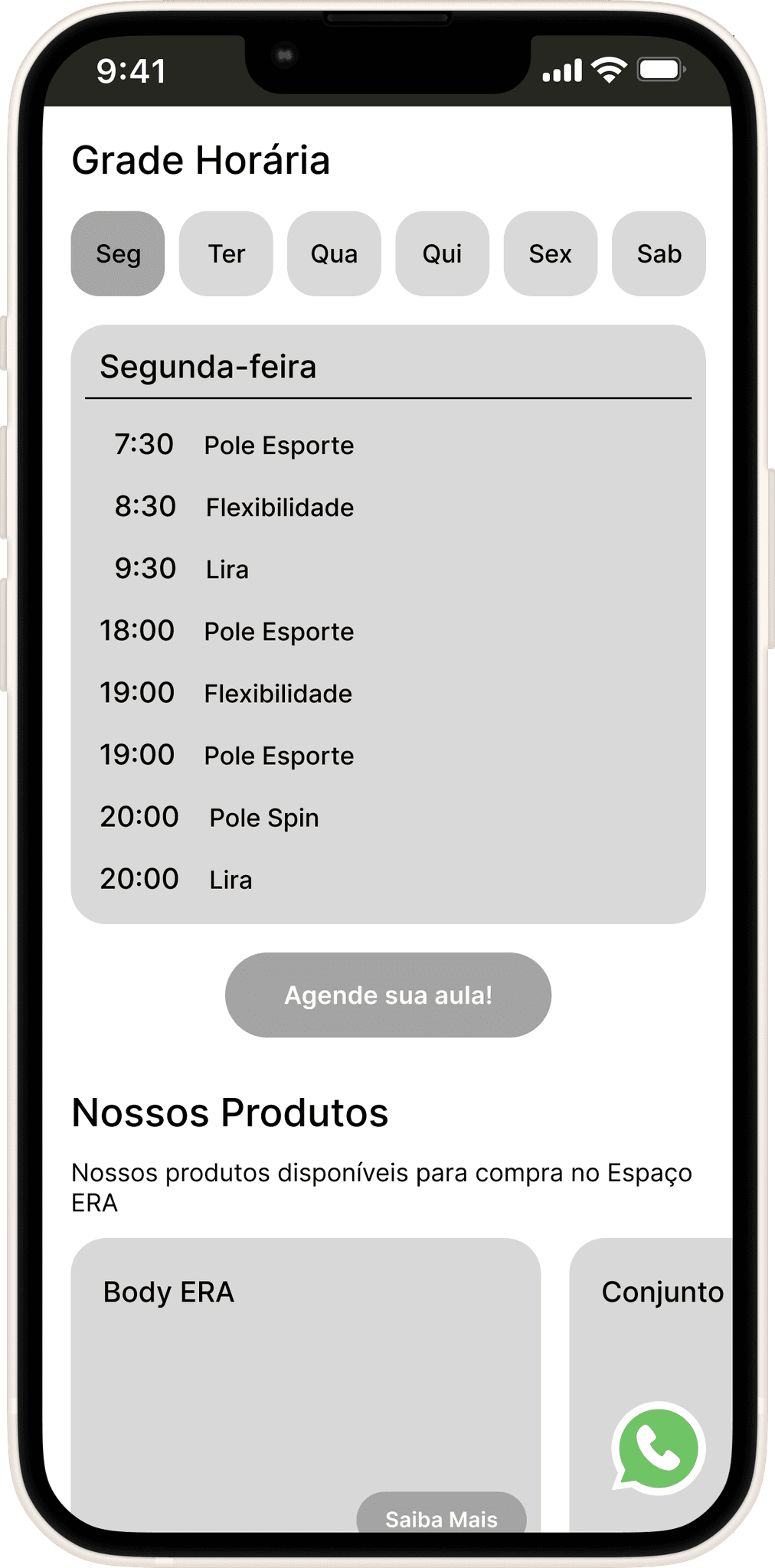
Classes Schedule
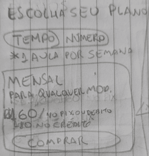
Initially, to maintain consistency with schedules already published on social media and to match the schedule patterns familiar to users, a more traditional timetable was created in Lo-Fi.
Lo-Fi
Mid-Fi 1.0
Hi-Fi
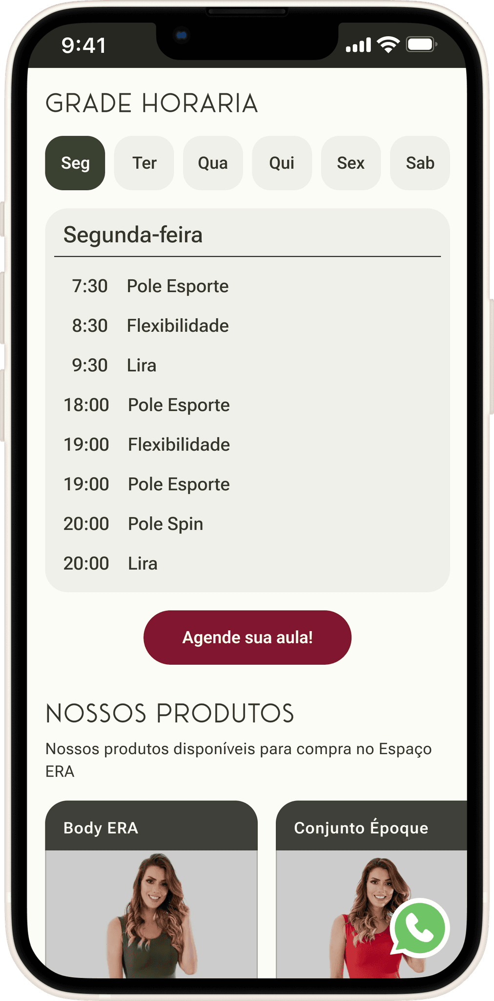
During testing, the Mid-fi design revealed many readability issues due to the large amount of information in the schedule table. Keeping this in mind, a new Mid-fi design was created to address the readability problems and make the daily schedule easier to view. Both the Mid-fi and Hi-fi designs were tested and approved without any issues.
prototyping and testing
In this section of the case, we will cover the entire process behind the creation of the interfaces and showcase the interfaces themselves. Since this is a detailed and somewhat lengthy topic, the content has been divided into subsections that reflect the project’s objectives
To access the desired subsection or theme, you only need to click on the respective subsection button below:
Clear Information
Information Structure
Responsive WebApp
Visual Branding Continuation
Brand Establishment
Quicker Customer Conversion
CLEAR INFORMATION
Classes
Based on the needs expressed in the interviews, a text description of the class was provided, along with a video for better understanding by those unfamiliar with it, as well as information on attire, schedules, and key tips. The goal is to address questions both current and potential students, thereby reducing the number of interactions and communications required from staff.
Mid-Fi 1.0
Usability Testing Insights:
Identify which teachers are assigned to specific classes at certain times
Improve clarity of the schedule. Solved by vertically aligning class times regardless of the day
The need to know pricing at this point during navigation. Solved by adding a pricing/plans section just below for easier access and clarity.
Lack of continuity and flow on the page. Solved by adding cards that direct users to other relevant and associated pages..
Hi-Fi
1
2
3
4
Teachers
Based on the needs expressed in the interviews, a text description of each teacher was provided, along with a performance video to better understand their style, the classes they teach, and links to their preferred social media for further exploration if desired.
Usability Testing Insights:
Some users got lost at certain points and didn’t know which teacher was being referred to. This was solved by adding the teacher’s name in the class section, creating an additional point of reference
The same issue of lack of continuity and flow on the page. Solved by adding cards that direct users to other relevant and associated pages.
Mid-Fi 1.0
Hi-Fi
1
2
How to get there, Location and Parking
Location was a high priority in this project. The need to highlight two related factors was also identified: parking (mentioned by some interviewees) and directions for public transportation (specifically the metro, including walking time for safety and convenience).
Lo-Fi
Mid-Fi 1.0
Hi-Fi
Plans and Passes
The Plans and Passes (TotalPass and Gympass) sections complement each other, forming the pricing section. The choice of drop-down cards was particularly necessary due to the large amount of information in this section, allowing users to focus on their preferred options
Lo-Fi
Mid-Fi 1.0
1
2
Hi-Fi
After 2 rounds of usability testing, it was noted a few needs and necessary changes:
The toggle button for selecting the plan type caused a lot of confusion, and users didn’t understand what it referred to. This was resolved by clarifying the text within the button, adding 'of classes.'
The prices had inconsistencies due to decimal points and the different use of commas, which caused confusion for the general public. This was resolved by using commas only for decimal places and periods for numbers in the thousands. Elevated font size was also used for the decimal places.
Hi-Fi
Tips and FAQ
Lo-Fi
Mid-Fi 1.0
Hi-Fi
The Tips and FAQs page is somewhat important to users; however, its significance is more evident during the period before the first class or during the initial classes.
One factor that emerged during usability testing was the need for broader reach and access to this section on the homepage. This was addressed by adding a link to this page in the navigation cards at the bottom of the homepage, a solution that became a standard for all pages, as mentioned earlier.
Classes Schedule
Initially, to maintain consistency with schedules already published on social media and to match the schedule patterns familiar to users, a more traditional timetable was created in Lo-Fi.
Lo-Fi
Mid-Fi 1.0
Hi-Fi
During testing, the Mid-fi design revealed many readability issues due to the large amount of information in the schedule table. Keeping this in mind, a new Mid-fi design was created to address the readability problems and make the daily schedule easier to view. Both the Mid-fi and Hi-fi designs were tested and approved without any issues.
prototyping and testing
Nesta seção do caso, iremos abordar todo o processo por trás da criação das interfaces e mostrar as interfaces em si. Por ser um tema muito detalhado e levemente longo, o conteúdo foi separado em subseções que refletem os objetivos do projeto.
To access the desired subsection or theme, you only need to click on the respective subsection button below:
Clear Information
Information Structure
Responsive WebApp
Visual Branding Continuation
Brand Establishment
Quicker Customer Conversion
CLEAR INFORMATION
Classes
Based on the needs expressed in the interviews, a text description of the class was provided, along with a video for better understanding by those unfamiliar with it, as well as information on attire, schedules, and key tips. The goal is to address questions both current and potential students, thereby reducing the number of interactions and communications required from staff.
Mid-Fi 1.0
Usability Testing Insights:
Identify which teachers are assigned to specific classes at certain times
Improve clarity of the schedule. Solved by vertically aligning class times regardless of the day
The need to know pricing at this point during navigation. Solved by adding a pricing/plans section just below for easier access and clarity.
Lack of continuity and flow on the page. Solved by adding cards that direct users to other relevant and associated pages..
Hi-Fi
1
2
3
4
Professores
Based on the needs expressed in the interviews, a text description of each teacher was provided, along with a performance video to better understand their style, the classes they teach, and links to their preferred social media for further exploration if desired.
Usability Testing Insights:
Some users got lost at certain points and didn’t know which teacher was being referred to. This was solved by adding the teacher’s name in the class section, creating an additional point of reference
The same issue of lack of continuity and flow on the page. Solved by adding cards that direct users to other relevant and associated pages.
Mid-Fi 1.0
Hi-Fi
1
2
How to get there, Location and Parking
Location was a high priority in this project. The need to highlight two related factors was also identified: parking (mentioned by some interviewees) and directions for public transportation (specifically the metro, including walking time for safety and convenience).
Lo-Fi
Mid-Fi 1.0
Hi-Fi
Plans and Passes
The Plans and Passes (TotalPass and Gympass) sections complement each other, forming the pricing section. The choice of drop-down cards was particularly necessary due to the large amount of information in this section, allowing users to focus on their preferred options
Lo-Fi
1
Mid-Fi 1.0
Hi-Fi
2
After 2 rounds of usability testing, it was noted a few needs and necessary changes:
The toggle button for selecting the plan type caused a lot of confusion, and users didn’t understand what it referred to. This was resolved by clarifying the text within the button, adding 'of classes.'
The prices had inconsistencies due to decimal points and the different use of commas, which caused confusion for the general public. This was resolved by using commas only for decimal places and periods for numbers in the thousands. Elevated font size was also used for the decimal places.
Hi-Fi
Tips and FAQ
Lo-Fi
Mid-Fi 1.0
Hi-Fi
The Tips and FAQs page is somewhat important to users; however, its significance is more evident during the period before the first class or during the initial classes.
Um fator que apareceu durante os testes de usabilidade foi a necessidade de ser mais acessível na página inicial, solucionado inserindo esta página nos cards de direcionamento ao final da página inicial. Algo que virou padrão para todas as páginas, como mencionado anteriormente.
Classes Schedule
Initially, to maintain consistency with schedules already published on social media and to match the schedule patterns familiar to users, a more traditional timetable was created in Lo-Fi.
Lo-Fi
Mid-Fi 1.0
Hi-Fi
During testing, the Mid-fi design revealed many readability issues due to the large amount of information in the schedule table. Keeping this in mind, a new Mid-fi design was created to address the readability problems and make the daily schedule easier to view. Both the Mid-fi and Hi-fi designs were tested and approved without any issues.
ABOUT THE USABILITY TESTING
ABOUT THE USABILITY TESTING
There were 2 rounds of Usability Testing:
In each round were made 5 tests (10 in total)
Just like research, the users pool were made of current students and non-students
The first round was done with the first Mid-Fidelity Prototype
The second round was made with the High-Fidelity Prototype
All the tests were moderated and online
Why:
The idea was to gather as many user insights as possible from the start of the interface design process to avoid major issues in later stages. The focus on a minimum of 5 tests per round is due to the need for a sufficient sample size to draw conclusions and identify problematic patterns. However, I avoided exceeding 5 tests to optimize my time and budget, and to prevent unnecessary test saturation, as described in Jacob Nielsen's study.
closing
closing
Recap
Recap
Responsive Web App - Focused on Mobile with Desktop as a secondary.
Clear information - More detailed identification and description of teachers and classes (with additional visual content); Parking, Location, Directions, GymPass, Plans and how it works, Pricing, FAQs, and Class Schedule
Continuation of the Visual Branding
Make customer conversion faster and clearer
Establish the brand
Next Steps
Next Steps
Final adjustments and one more round of final testing, if necessary.
Prepare the handoff for the Developer
Transfer the Design to Implementation with the Developer
Study potential future projects and expansion of the MVP
Final adjustments and one more round of final testing, if necessary.
Prepare the handoff for the Developer
Transfer the Design to Implementation with the Developer
Study potential future projects and expansion of the MVP
RENATO RULLI
RENATO RULLI