RENATO RULLI
CASE STUDY: f1tv
Redesign Process - 2022
Redesign Process - 2022
Scope of the Project
Only UI Design Process
High Fidelity Prototype for Mobile
Front or Back-end programming is not included
Only UI Design Process
High Fidelity Prototype for Mobile
Front or Back-end programming is not included

Agenda
Introduction to the Brand and App
Initial Research
Usability Testing
About the Redesign
Redesign
Conclusion
Introduction to the Brand and App
Initial Research
Usability Testing
About the Redesign
Redesign
Conclusion
Introduction to the brand and app
Introdução da Marca e do App
About F1TV
F1TV is the Formula 1 streaming platform. Launched in 2018, it is a relatively new addition to the market. Its main function is to broadcast live the thrilling races and sessions of the Formula 1 Grand Prix throughout the year, offering exclusive features such as onboard cameras, multiple language commentary options, exclusive statistics, and real-time updates.
F1TV is the Formula 1 streaming platform. Launched in 2018, it is a relatively new addition to the market. Its main function is to broadcast live the thrilling races and sessions of the Formula 1 Grand Prix throughout the year, offering exclusive features such as onboard cameras, multiple language commentary options, exclusive statistics, and real-time updates.
Slogan: We race as One
Slogan: We race as One

About the App
First Priority
The streaming player impresses with its sophistication and variety of features. It can be argued that Formula 1 excels in prioritizing this, offering a unique product in the market. Users can view in-car cameras, access exclusive statistics, and enjoy specialized coverage.
The streaming player impresses with its sophistication and variety of features. It can be argued that Formula 1 excels in prioritizing this, offering a unique product in the market. Users can view in-car cameras, access exclusive statistics, and enjoy specialized coverage.
Second Priority
The app offers a vast and comprehensive catalog of historical races, dating back to 1970, and also provides exclusive programs, including documentaries and interviews, some of which are produced weekly. However, the app’s secondary focus raises concerns about its overall design, which falls short of the standard expected from a market-leading app.
The app offers a vast and comprehensive catalog of historical races, dating back to 1970, and also provides exclusive programs, including documentaries and interviews, some of which are produced weekly. However, the app’s secondary focus raises concerns about its overall design, which falls short of the standard expected from a market-leading app.
Project Objective: To redesign the app, focusing on resolving issues related to the catalog and giving it the proper aesthetics that, as a Formula 1 enthusiast, I believe it deserves.
Initial research
Initial research
To understand the issues with the app, it was first necessary to conduct an initial research, primarily focusing on user reviews on platforms such as Google Play Store and Apple Store. As expected, there were an overwhelming number of useless reviews (technical complaints or random comments), but one common theme stood out:
To understand the issues with the app, it was first necessary to conduct an initial research, primarily focusing on user reviews on platforms such as Google Play Store and Apple Store. As expected, there were an overwhelming number of useless reviews (technical complaints or random comments), but one common theme stood out:
MASSIVE AMOUNT OF GREAT CONTENT, BUT THE MENU IS CONFUSING AND MISLEADING
MASSIVE AMOUNT OF GREAT CONTENT, BUT THE MENU IS CONFUSING AND MISLEADING
Then, the next step would be to confirm these insights with actual users of the app
Then, the next step would be to confirm these insights with actual users of the app
Some of the other insights mentioned:
Some of the other insights mentioned:
Add a "Continue Watching" feature
Add a "Continue Watching" feature
A download button for those who have bad connection or want to watch it offline
A download button for those who have bad connection or want to watch it offline
usability testing
usability testing
Test
I conducted an asynchronous usability test with 5 users from around the world who regularly use the app. The task I created was to find a specific program in its catalog that should theoretically be easy to locate: 'The 10 Brilliant Moments of Martin Brundle.'
It’s safe to say that users absolutely hated the task, reporting significant difficulty in completing it or even failing, due to confusing categories and challenging navigation throughout the app (including the lack of a search feature)
Some of the user's comments:
Some of the user's comments:
"A damn search bar..."
"A damn search bar..."
"I feel like I'm navigating in different categories, but realize I'm still on the same one"
"I feel like I'm navigating in different categories, but realize I'm still on the same one"
"So much good content, but no structure or operation for it"
"So much good content, but no structure or operation for it"
Actual App Interface
Actual App Interface
Home Page
Home Page
Title Page
Title Page
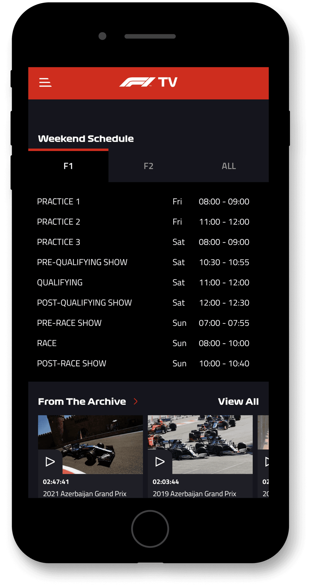
Weekend Schedule
Weekend Schedule
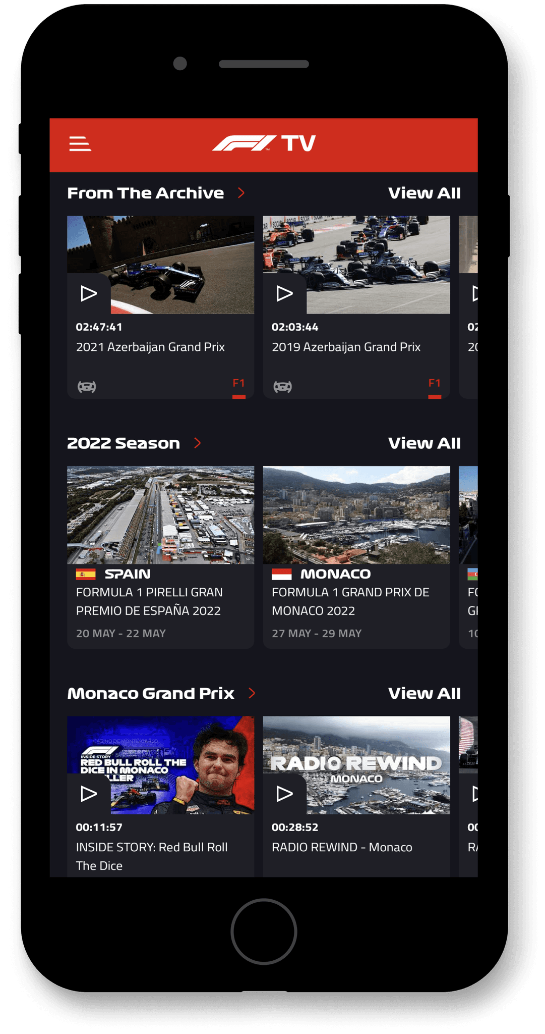
Cards
Cards
about the Redesign
about the Redesign
Redesign Goals
Creation of a search system
Introduction of a navigation bar to facilitate overall navigation throughout the app
Redesign of the app's overall aesthetics and organization.
Addition of a 'My Favorites' feature and the option to download content as an additional resource
Creation of a search system
Introduction of a navigation bar to facilitate overall navigation throughout the app
Redesign of the app's overall aesthetics and organization.
Addition of a 'My Favorites' feature and the option to download content as an additional resource
New Moodboard

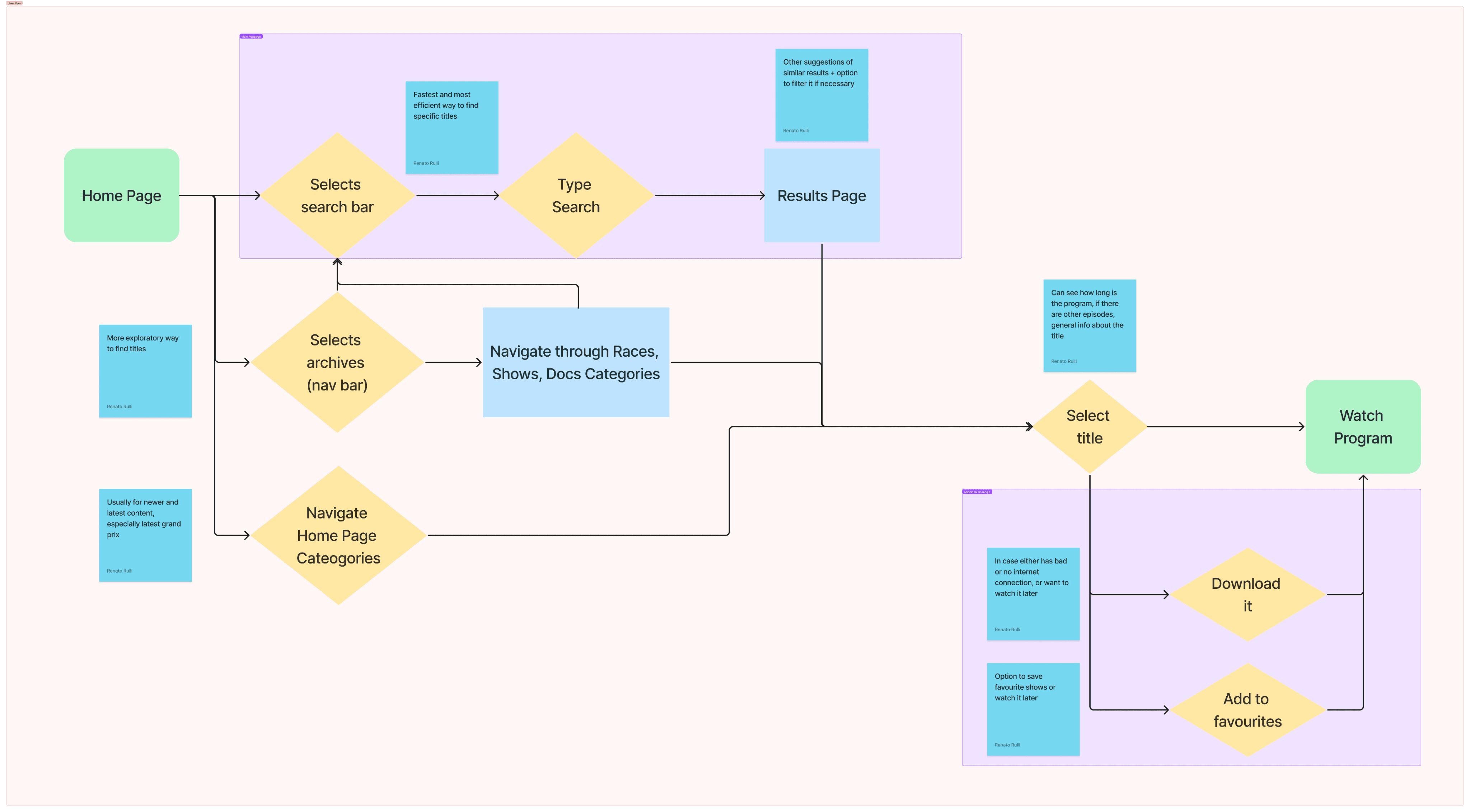
New User Flow Chart
It’s important to highlight the increased efficiency and speed that the new pathway offers users for navigation, compared to the more exploratory approach involving the use of archives and browsing through the homepage.
It’s important to highlight the increased efficiency and speed that the new pathway offers users for navigation, compared to the more exploratory approach involving the use of archives and browsing through the homepage.
Redesign
Redesign
Prototype
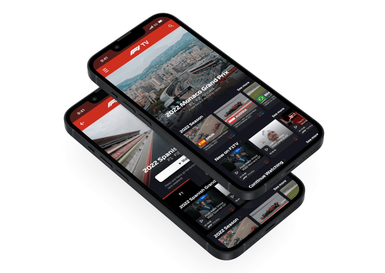
It's a pleasure to present my F1TV App Redesign
It's a pleasure to present my F1TV App Redesign
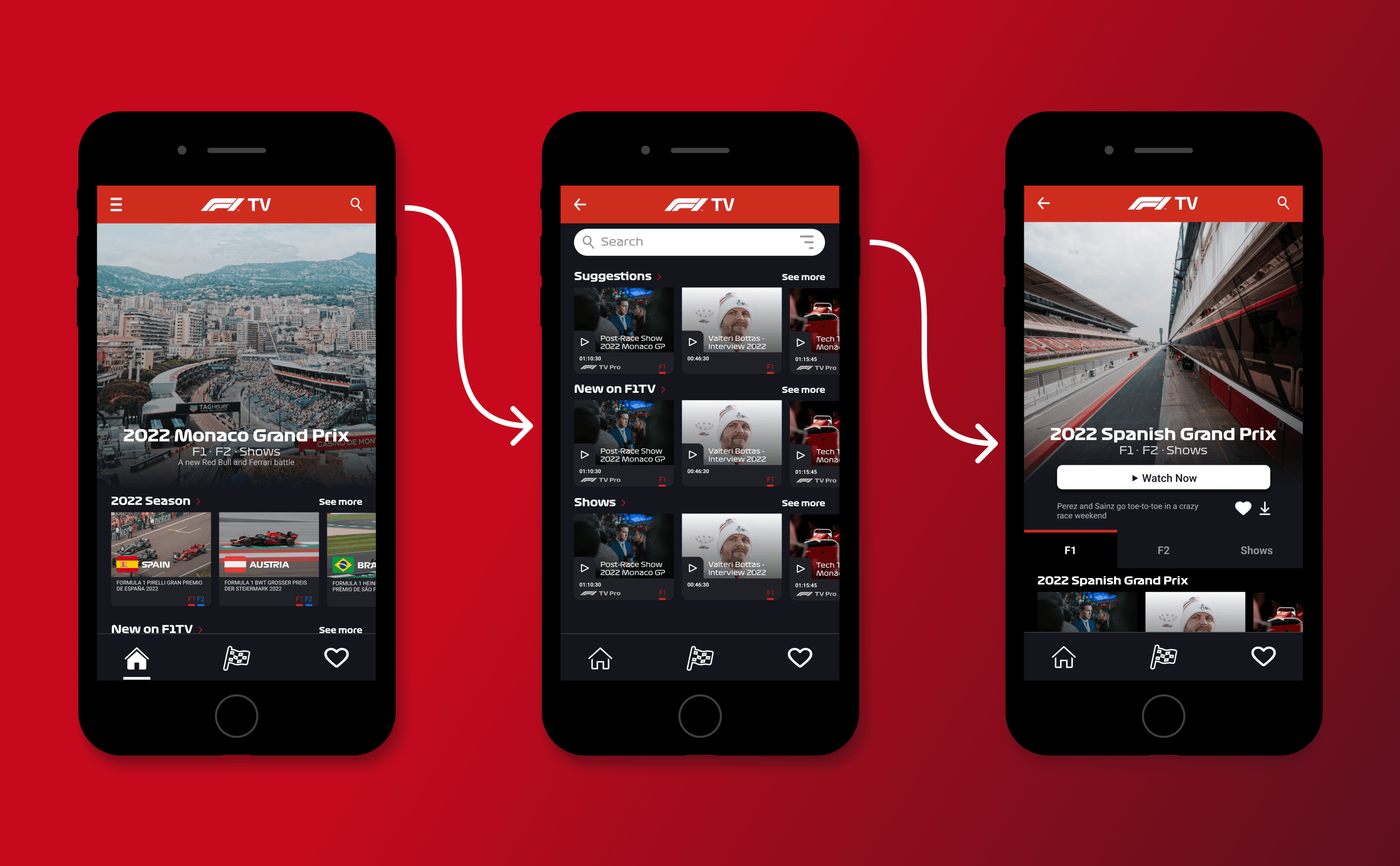
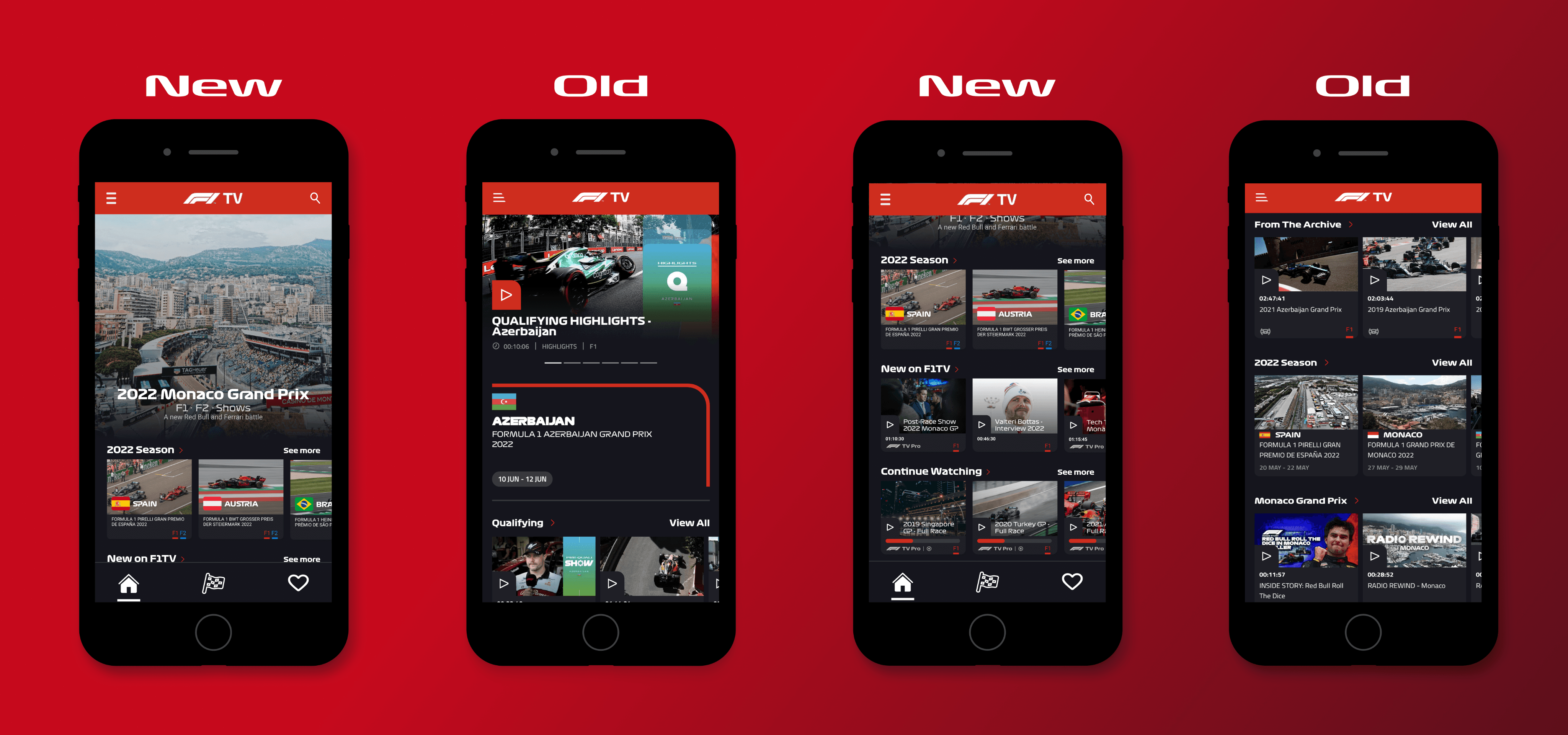
Research Flow
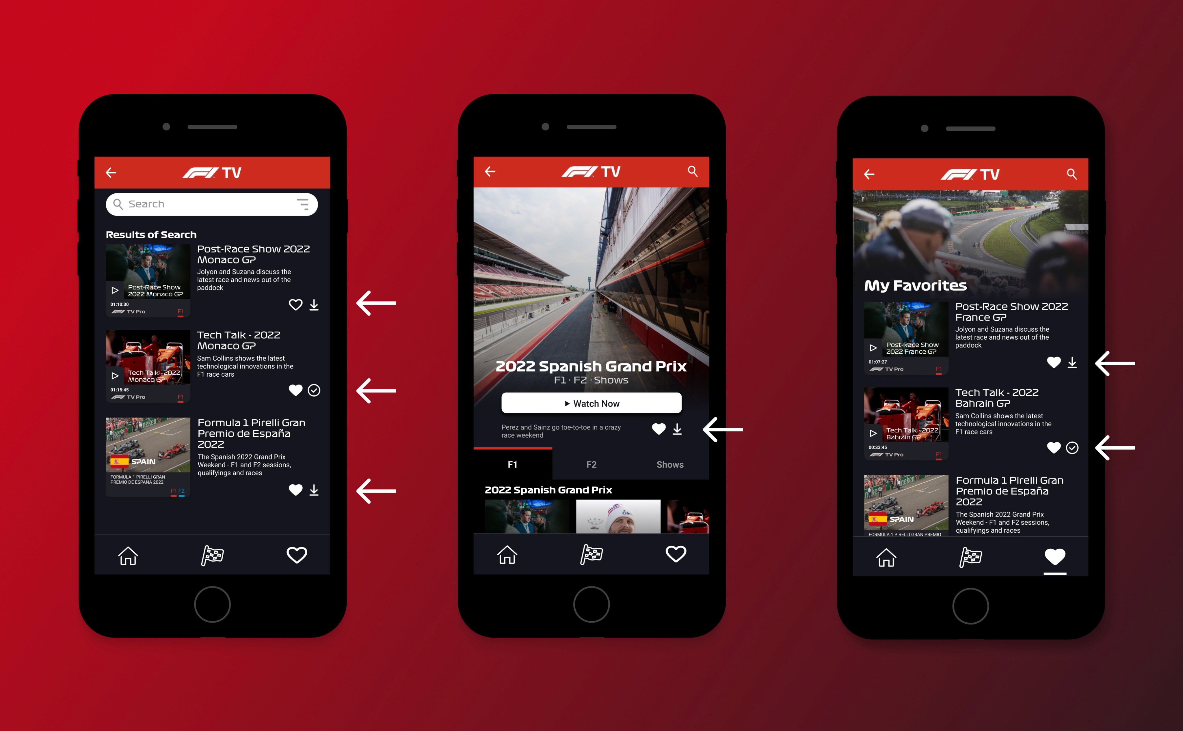
I added a search icon that balances the header with the side menu on the left, creating a more symmetrical presentation in the header.
When the user clicks on the search icon, they are directed to the search page, where programs related to their taste and history are suggested.
Tapping on the search bar allows the user to type in the program they are looking for, with an additional filter option on the right side of the search bar.
Navigation Bar
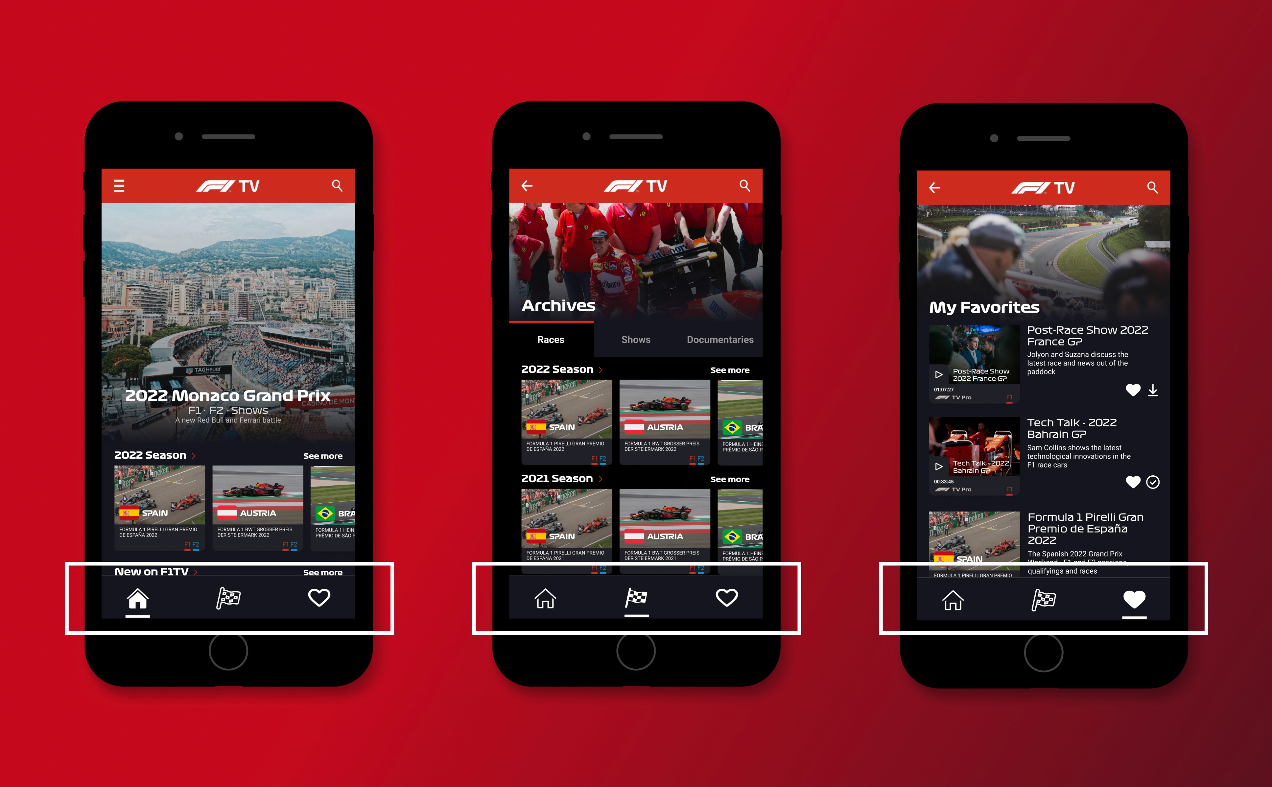
Since the header already included the search feature and even the side menu (with profile and other information), there was no significant need for more than the three icons in terms of navigation.
Since the header already included the search feature and even the side menu (with profile and other information), there was no significant need for more than the three icons in terms of navigation.
In order to help users navigate within the app, I added a white line that follows the icon when selected, along with an effect that fills the icons with white when tapped.
In order to help users navigate within the app, I added a white line that follows the icon when selected, along with an effect that fills the icons with white when tapped.
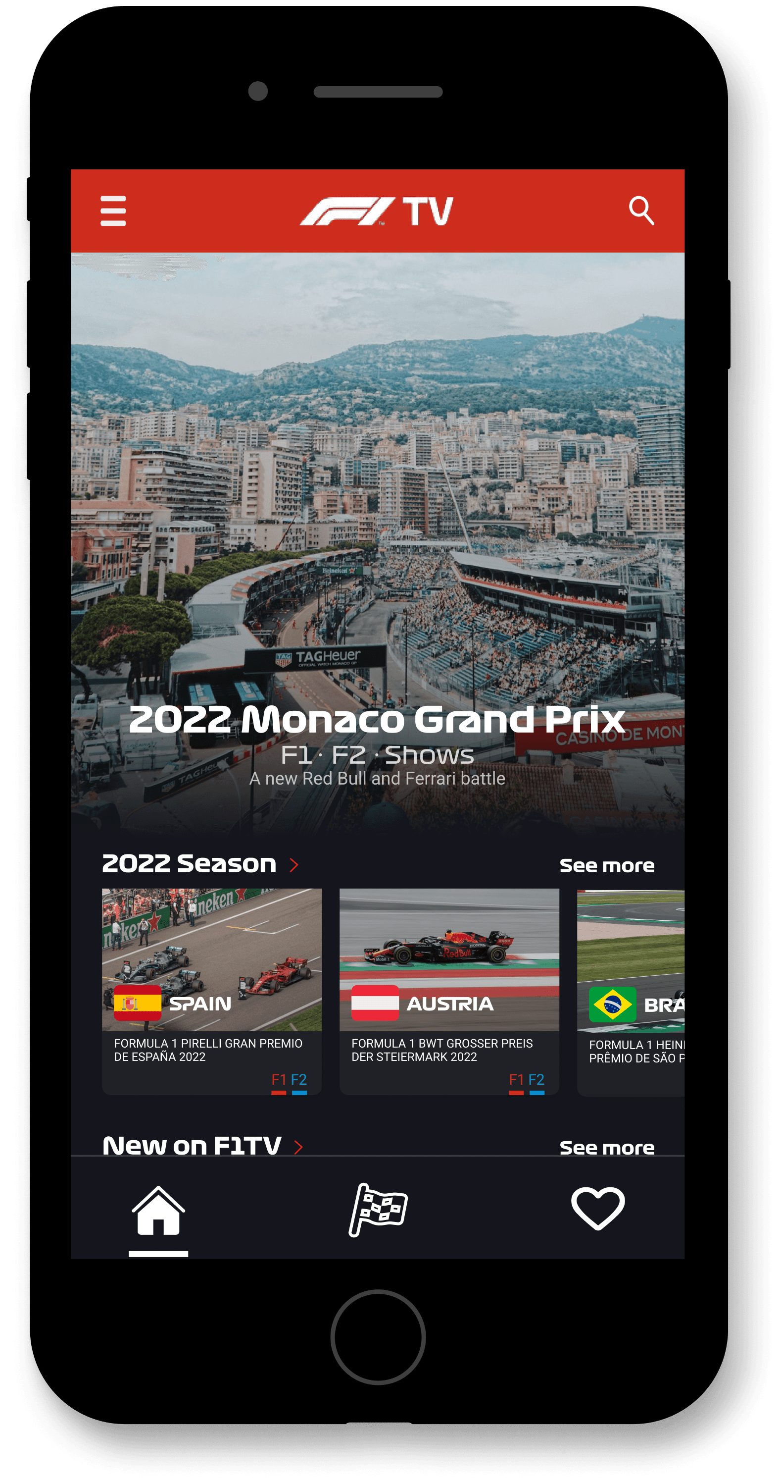
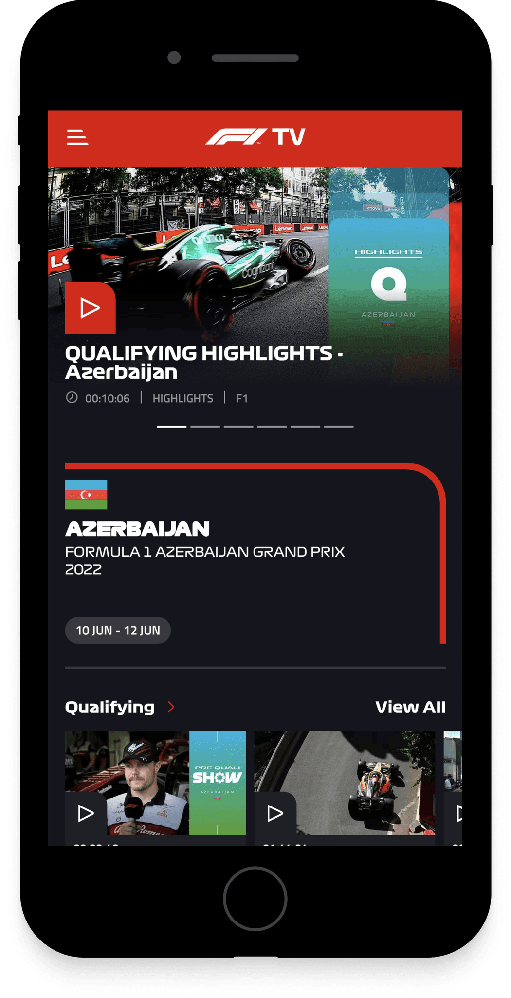
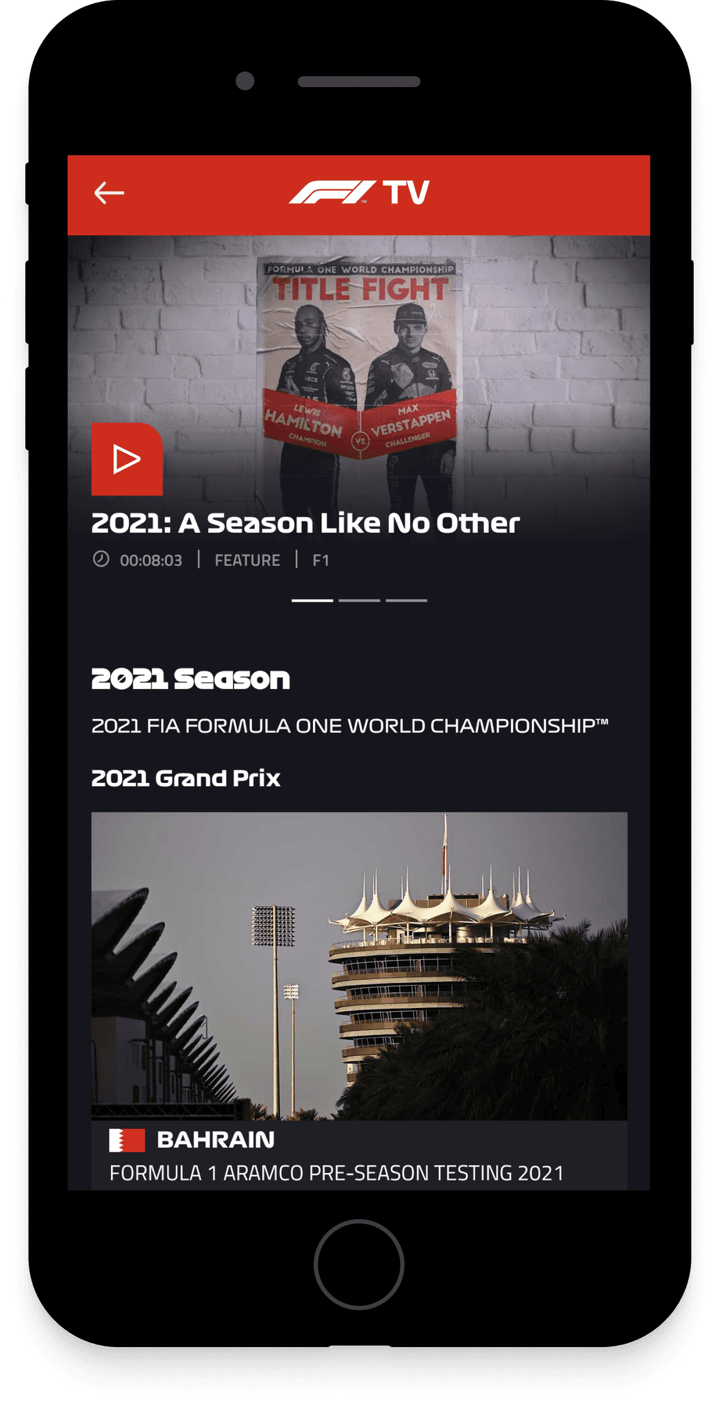
Aesthetics and Organization
The focus was on having larger, more striking photographs, inspired by the long posters of HBO Max that blend with the background color of the user interface. This effect is particularly noticeable on the Homepage and Title Page, prioritizing the dynamic and grand beauty of Formula 1.
The focus was on having larger, more striking photographs, inspired by the long posters of HBO Max that blend with the background color of the user interface. This effect is particularly noticeable on the Homepage and Title Page, prioritizing the dynamic and grand beauty of Formula 1.
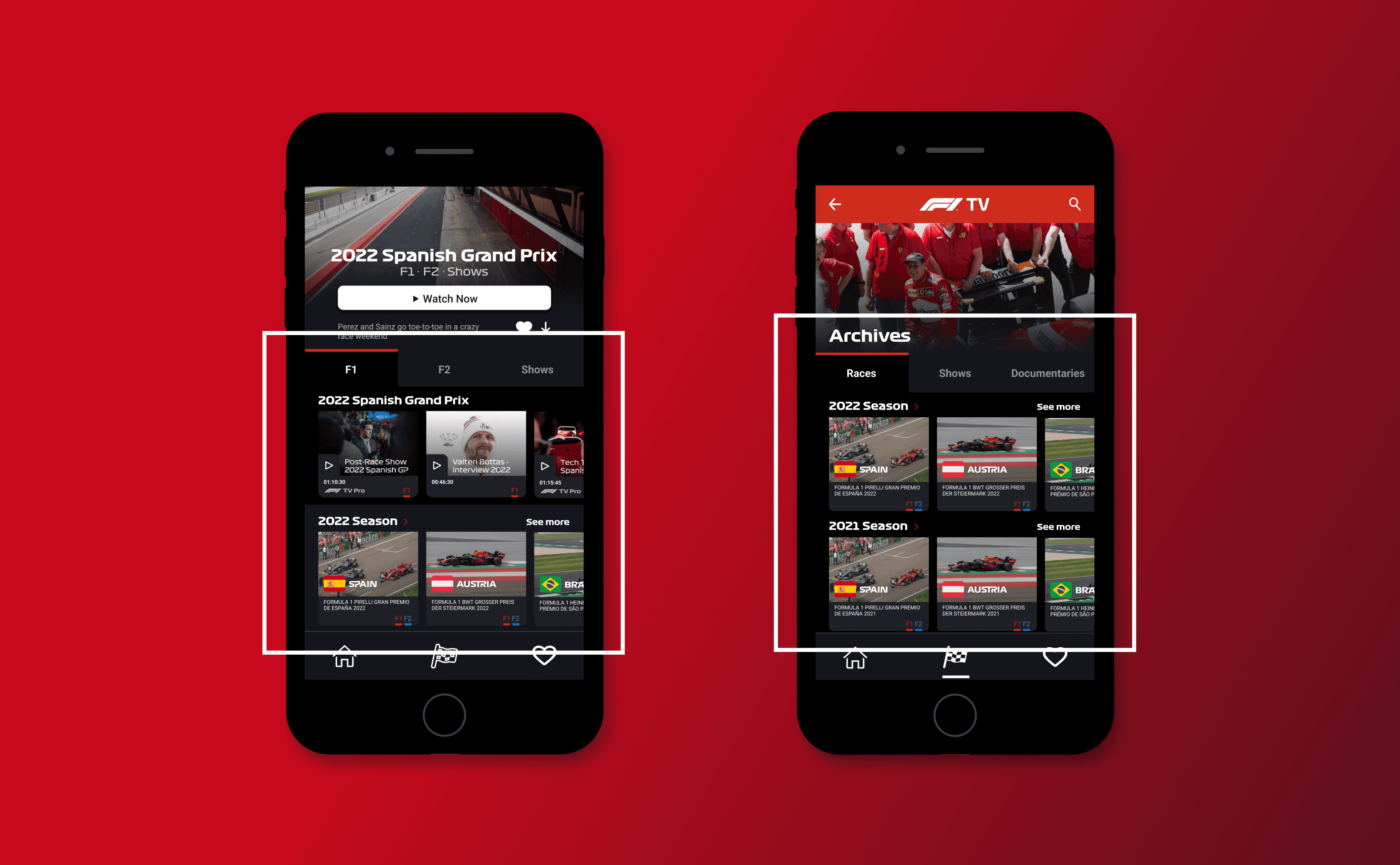
Note 1
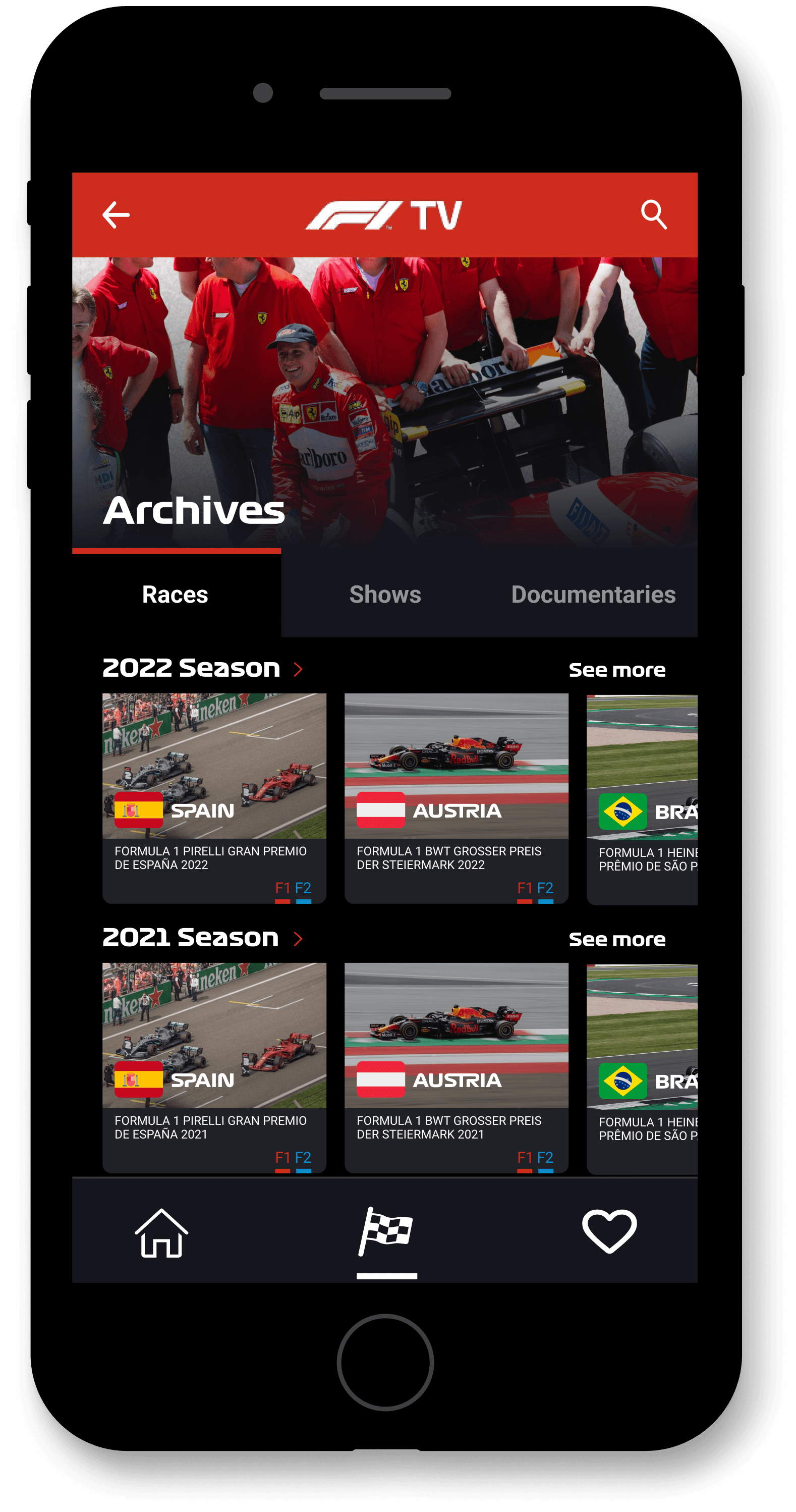
Consistency was a key factor in the redesign, with both the Title Page and Homepage sharing the poster's visual style. Additionally, on the Title Page, the 'Folder' containing other event videos (the black folder subdividing into F1, F2, and Shows) is the same on the Files page but now subdivided into Races, Shows, and Documentaries.
Consistency was a key factor in the redesign, with both the Title Page and Homepage sharing the poster's visual style. Additionally, on the Title Page, the 'Folder' containing other event videos (the black folder subdividing into F1, F2, and Shows) is the same on the Files page but now subdivided into Races, Shows, and Documentaries.
Note 2
It's important to note that the categories on the Archives page are now more defined and easily interchangeable (visible on the same screen), rather than having confusing categories presented in the side menu as before. Regarding categories, I also showcased potential improvements on the Homepage, such as 'Continue Watching'.
It's important to note that the categories on the Archives page are now more defined and easily interchangeable (visible on the same screen), rather than having confusing categories presented in the side menu as before. Regarding categories, I also showcased potential improvements on the Homepage, such as 'Continue Watching'.
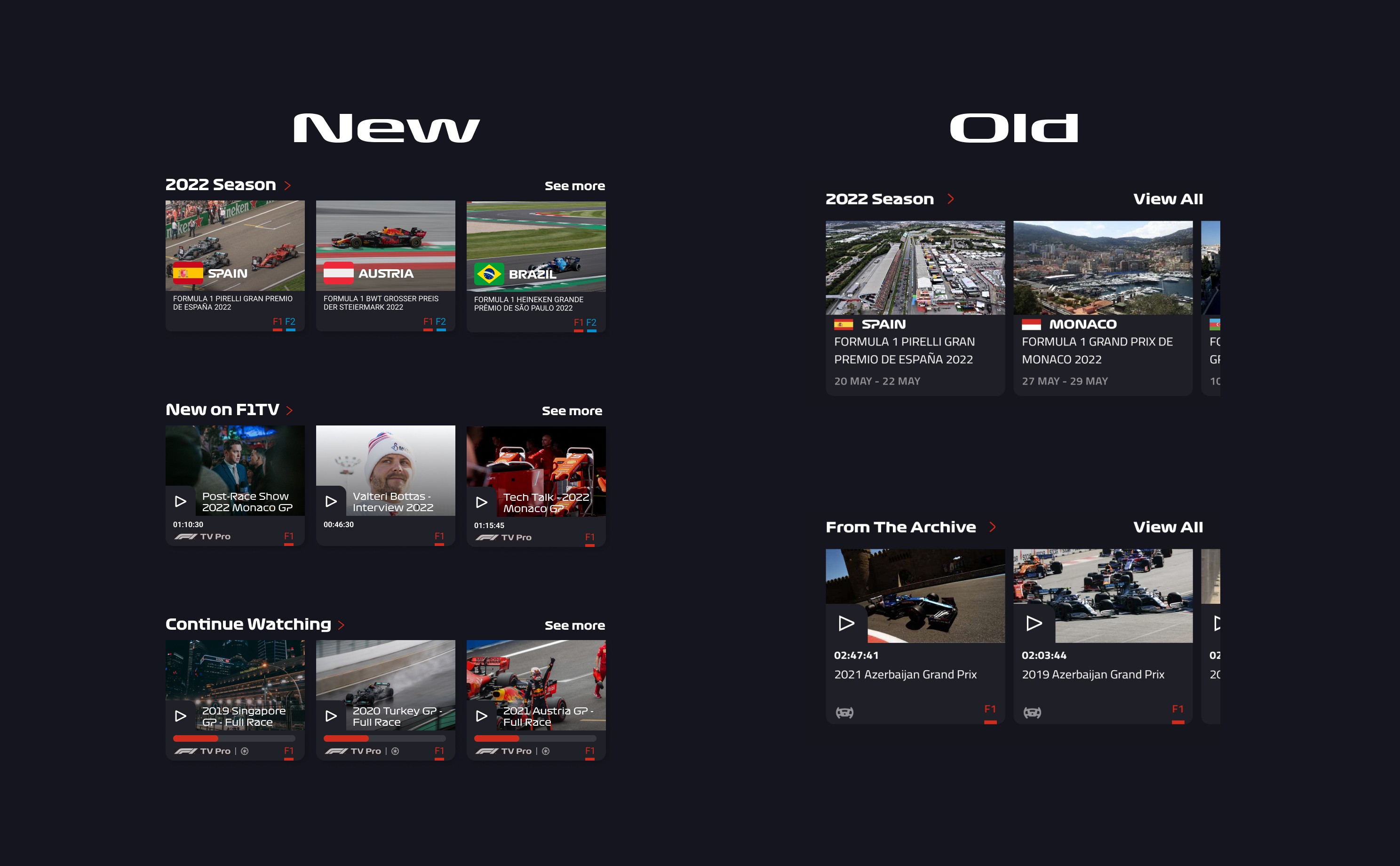
Program cards have also been reorganized and optimized with a focus on photography, featuring larger images and banners. The card title is now written at the bottom of the images. Additionally, I added a race category indicator on the Event cards (those without a play icon), showing F1 (in red) and F2 if the event includes Formula 2 races (in blue).
Program cards have also been reorganized and optimized with a focus on photography, featuring larger images and banners. The card title is now written at the bottom of the images. Additionally, I added a race category indicator on the Event cards (those without a play icon), showing F1 (in red) and F2 if the event includes Formula 2 races (in blue).
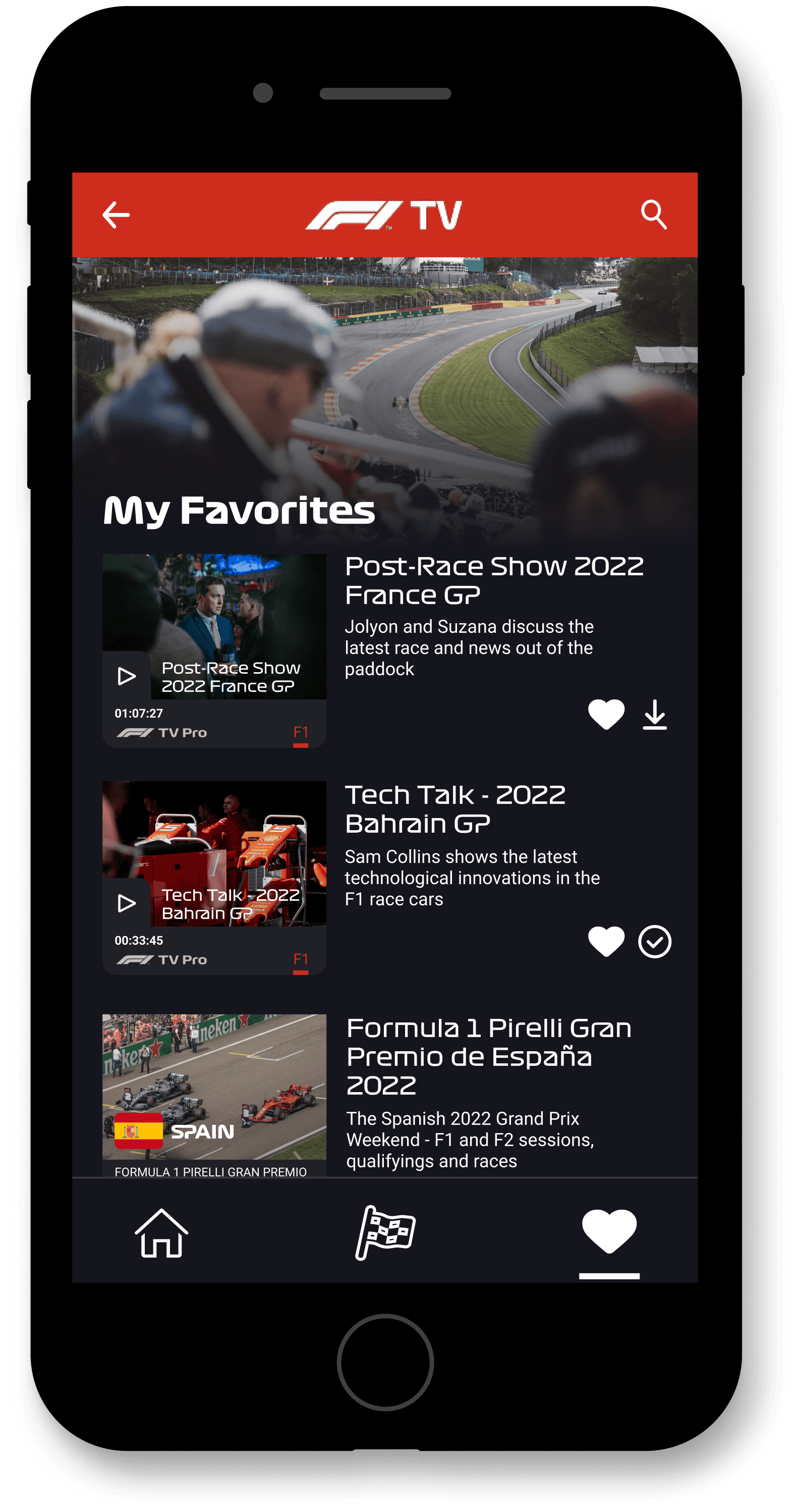
My Favorites and Download
To save to favorites, the user simply needs to tap on the small empty white heart icon on any of the screens above, with the download option located right next to it.
When tapped, the heart icon fills in, and the download icon transforms into a checkmark icon.
To save to favorites, the user simply needs to tap on the small empty white heart icon on any of the screens above, with the download option located right next to it.
When tapped, the heart icon fills in, and the download icon transforms into a checkmark icon.
Conclusion
Conclusion
This project aimed to illustrate and present better ways to design an app that is crucial for Formula 1 enthusiasts. It does not aim to solve all the problems but to express my perspective on the subject.
This project aimed to illustrate and present better ways to design an app that is crucial for Formula 1 enthusiasts. It does not aim to solve all the problems but to express my perspective on the subject.
It’s worth noting that on the day I completed this case study, the app underwent an update and finally introduced a search system. This is great luck for its users and a bit of bad luck for me, as much of my work may now seem less significant. However, it could be argued that my thesis and perspective were validated by the update.
It’s worth noting that on the day I completed this case study, the app underwent an update and finally introduced a search system. This is great luck for its users and a bit of bad luck for me, as much of my work may now seem less significant. However, it could be argued that my thesis and perspective were validated by the update.
RENATO RULLI
RENATO RULLI
Entre em contato através de:
Entre em contato através de: